Overview
Bash is an innovative social media platform centered on event planning and social networking. It enables users to organize and host events — called Bashes — designed for networking, connecting, and enjoying a night out. Bash makes it easy for young people to discover exciting activities, expand their social circle, and forge new connections. Focused on bringing people together for memorable nights and meaningful interactions, Bash transforms event planning into a social experience.
Role
UX/UI Designer
Tools
Figma, Slack, Monday, Google Suite
Process
Discovery, Define, Design Sprint A, Design Sprint B, Delivery, Reflection
The Problem
The Solution
01
Discovery
Client Kickoff
Let's lay the groundwork…
The project kicked off with a client meeting, where the design team and client aligned on the scope, objectives, and deliverables to establish a strong communication foundation. The team received a client questionnaire and a mission overview for Bash, providing insight into the platform’s target audience, desired look and feel, and core values. The client underscored their primary goals for this phase: to create a clear path for fostering user engagement and connection. Additionally, Figma files with previous designs and design systems were shared to ensure continuity.
Identifying Gaps in the User Journey
Analyze
To start, my team and I analyzed the current Bash design to understand its functionality, user experience, and existing user flows. At its core, Bash is an event planning platform where users can view upcoming and featured Bashes, track events they've attended or hosted, and RSVP to Bashes they've been invited to. While these features worked well, there was no option for users to post about their experiences after attending a Bash, leaving the user journey incomplete once the event ended.
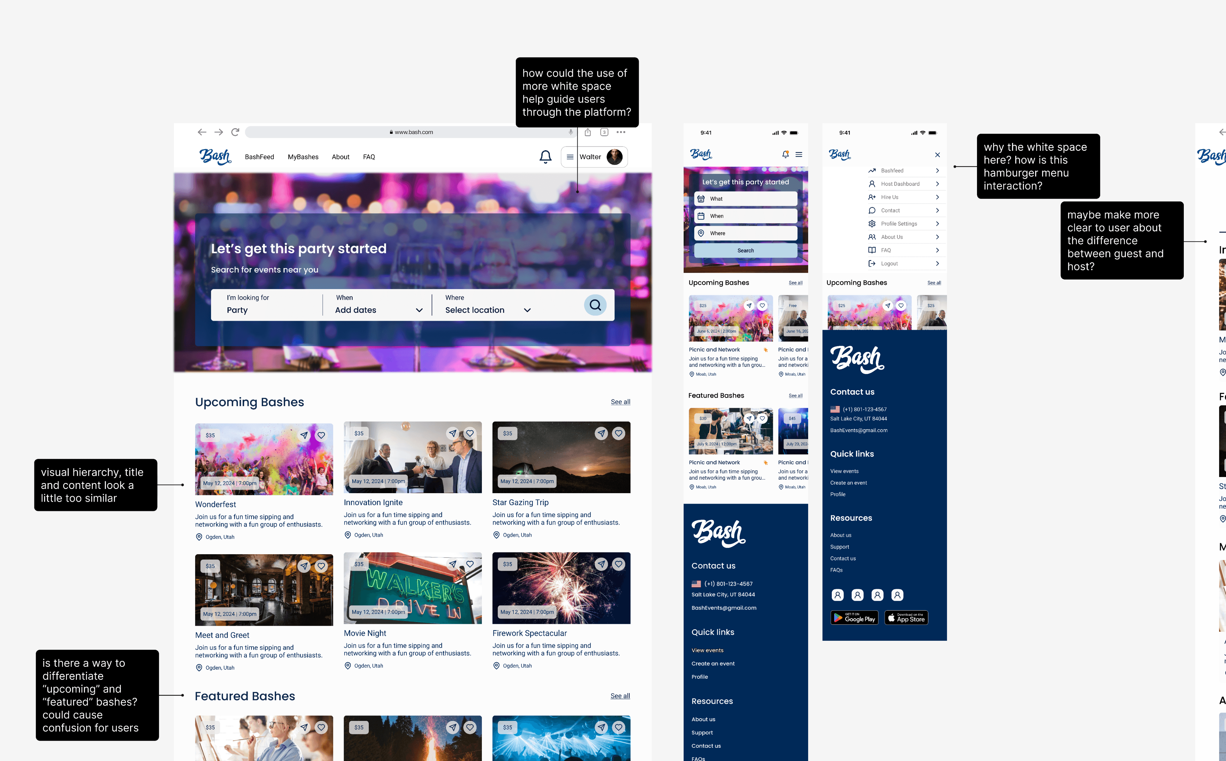
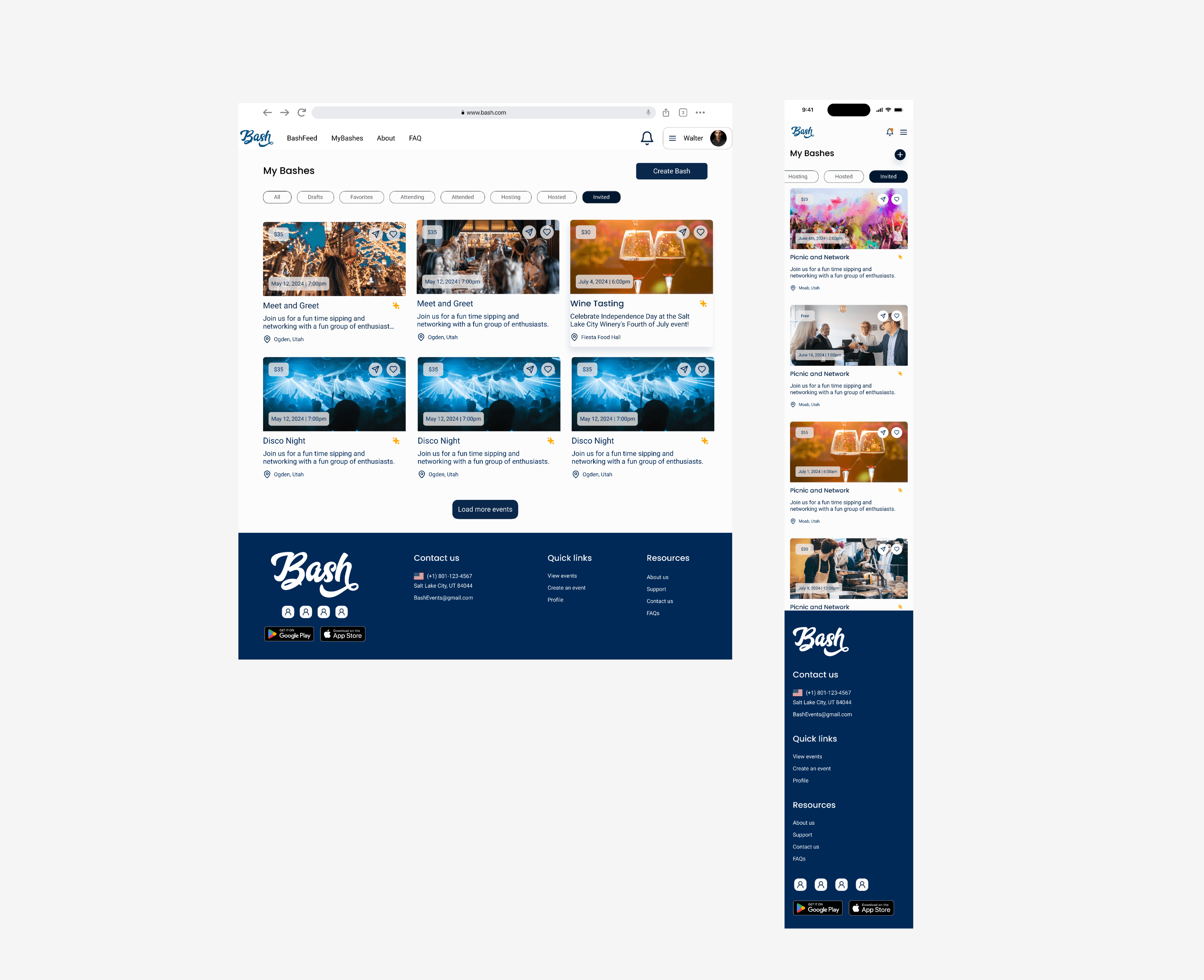
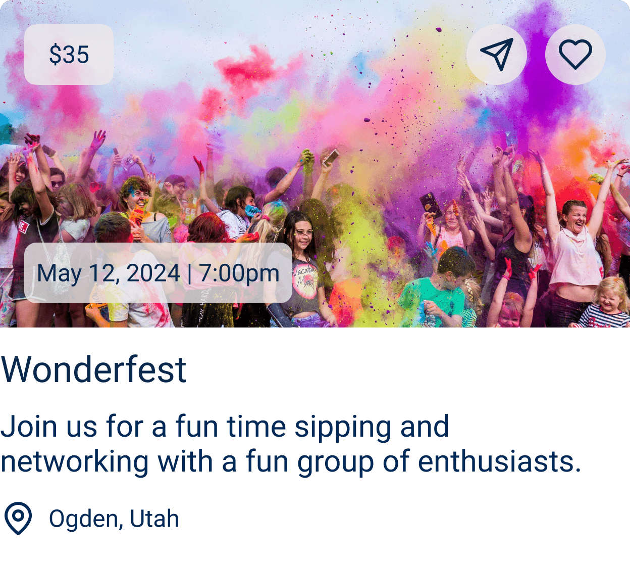
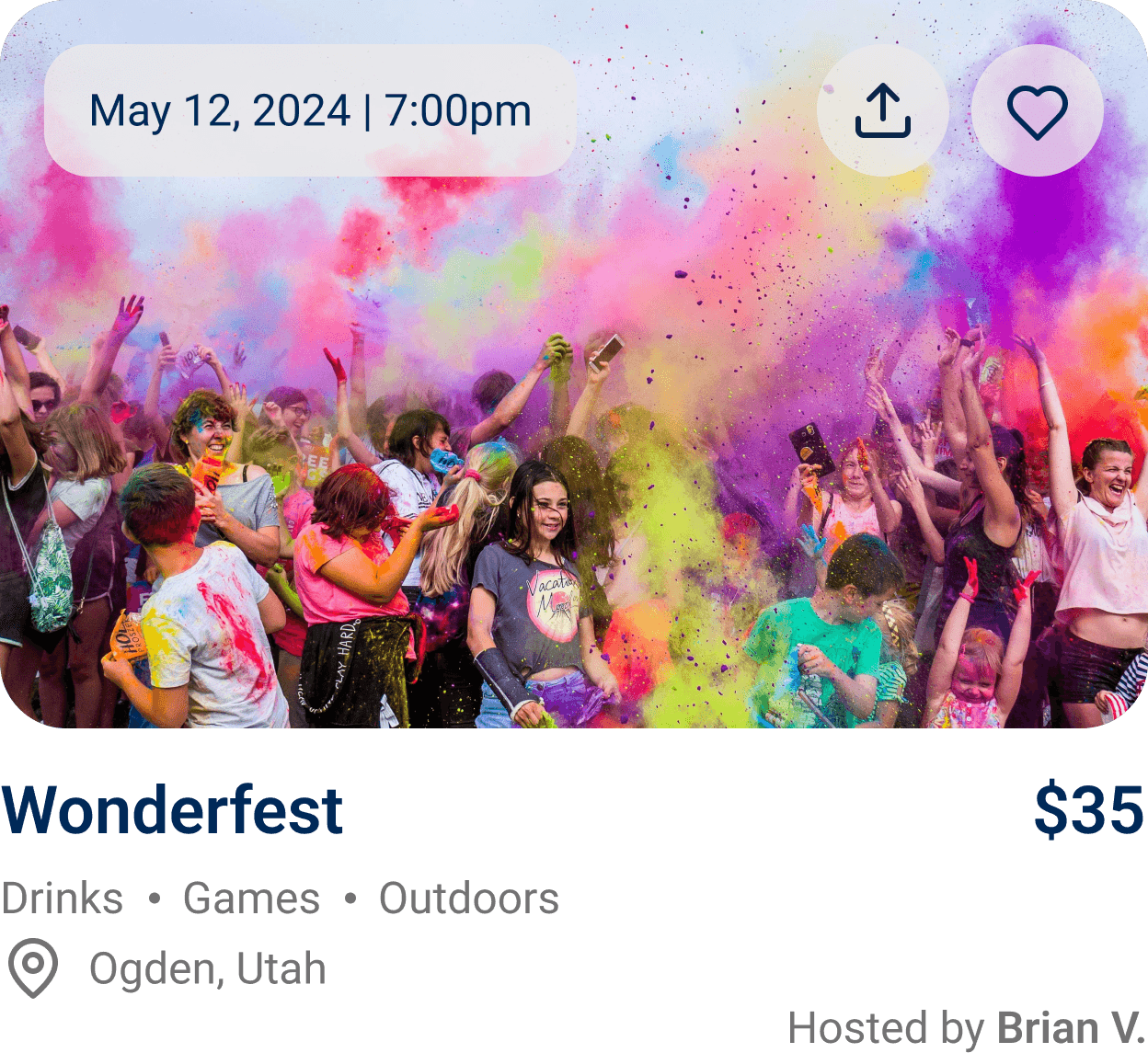
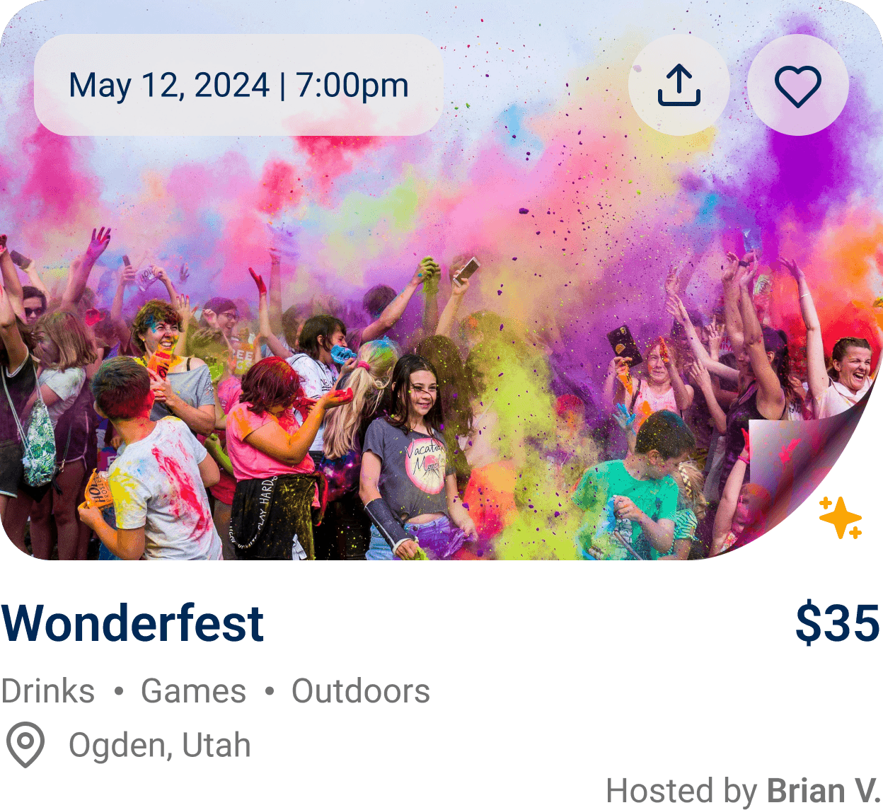
We also studied how the information architecture organized users' Bashes across both mobile and desktop. I observed how the design system enabled easy access to different Bash categories, which we would need to maintain and incorporate into our designs. Additionally, I noted opportunities for improvement in the Bash card design, particularly with text hierarchy and card visuals.
Exploring Competitors to Integrate Solutions
Research
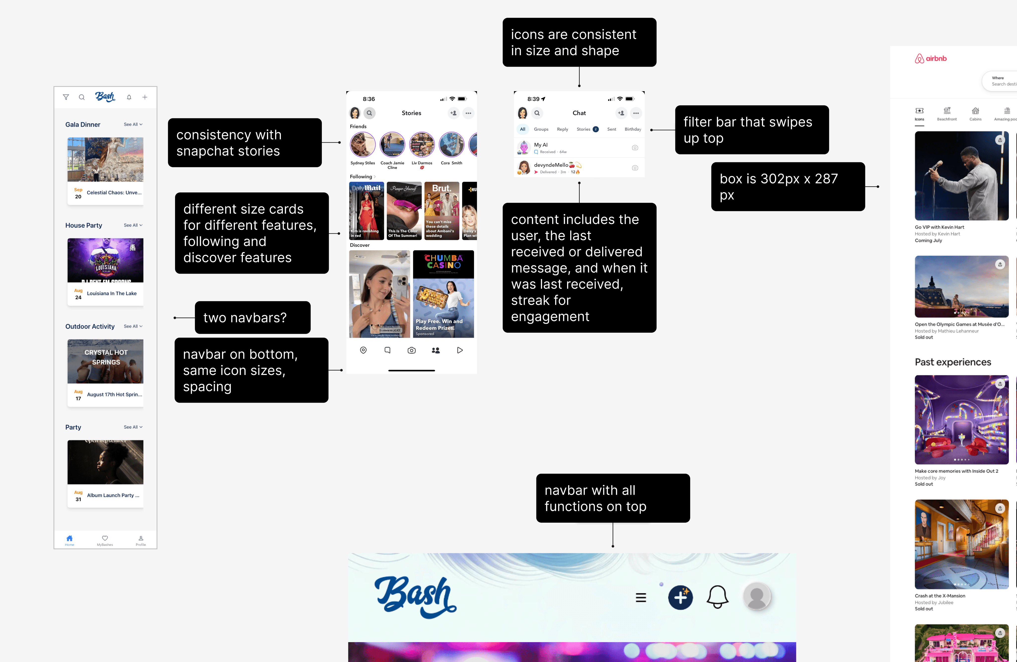
The team conducted research on various social media platforms, as well as platforms with similar user interfaces to Bash. This included Snapchat, Instagram, Airbnb, and the current live version of Bash. The goal was to gather insights and ideas on how we might solve the challenge of introducing an experience-sharing feature, ensuring it would fit seamlessly within the existing platform while enhancing user engagement.
Mobile navbar accessibility
The bottom navbar allows users to easily navigate between primary functions within the app. It is designed for convenience, placing key actions within easy reach of the thumb on a mobile device, making the app more user-friendly and engaging.
Quick posts and live stories
Social media platforms like Instagram, Snapchat, and Facebook have incorporated live videos and stories, allowing users to quickly share real-time moments with their feed. These stories are quick, easy to post, and less formal than permanent profile posts, encouraging user engagement. They disappear after a short time, emphasizing the immediacy of the moment.
Key design principles
Websites like Airbnb that utilize component cards emphasize text hierarchy, with bold headers and smaller, lighter text beneath. This design approach draws attention to key information while maintaining a clean and organized user interface.
02
Define
Sketches
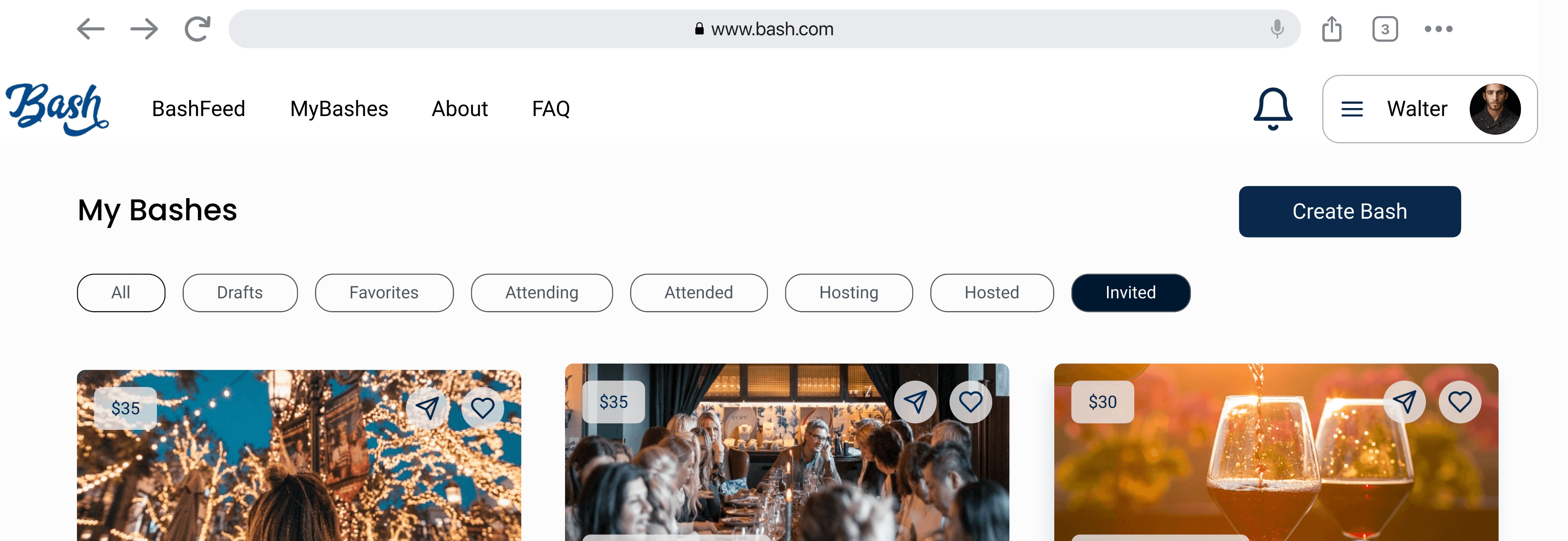
In my initial round of sketching, I focused on improving the information architecture and organization of the MyBashes feature on Bash. The original setup categorized events by Bashes invited to, favorited, attending, attended, and potentially RSVPing to. However, this arrangement felt cluttered and confusing, especially with similar terms like "Attending" vs. "Attended" and "Guests" vs. "Host." For example, it was unclear if the "Guests" tab referred to Bashes where the user was a guest or the guests attending a user-hosted Bash.
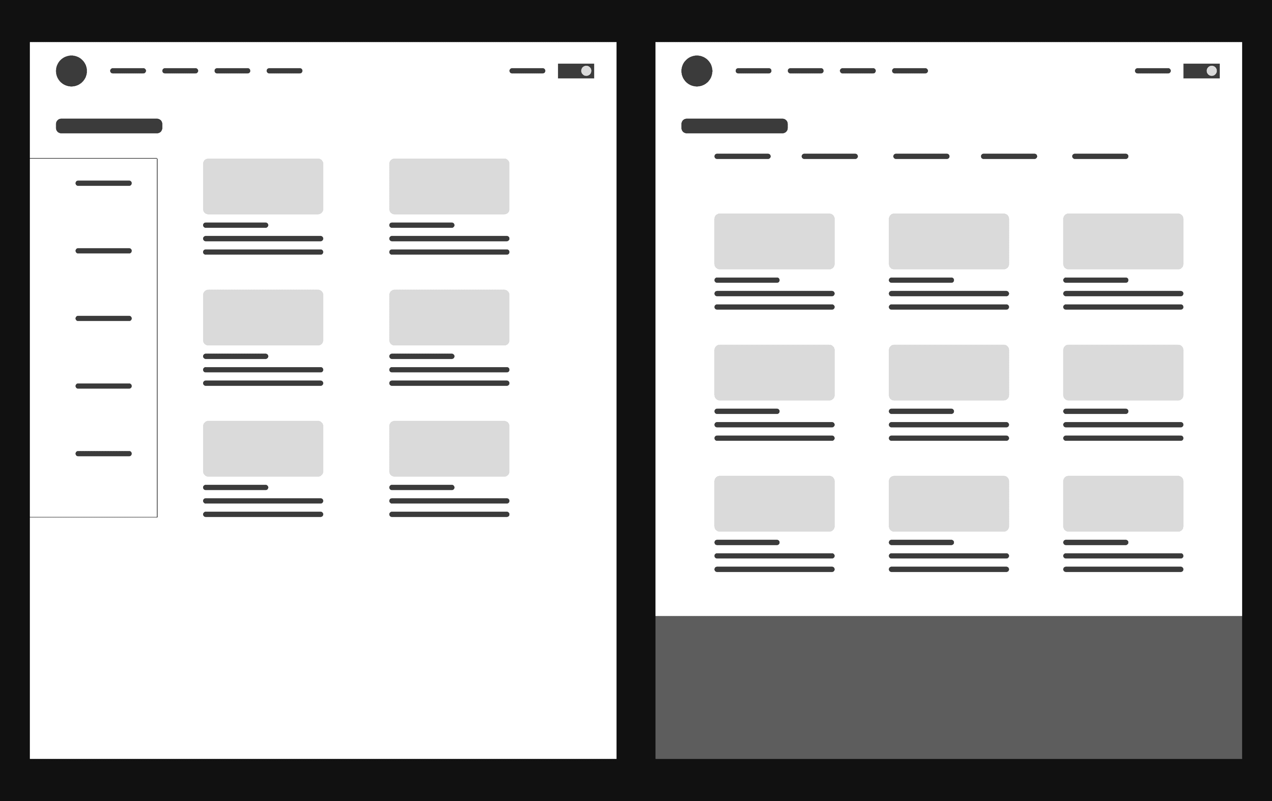
I proposed organizing Bashes into grouped sections with subsections within each. The categories naturally fell into two groups: "Past and Future Bashes" or "Attendee and Host Bashes." However, the latter option still risked user confusion between "Attended" and "Attending." So, I suggested grouping Bashes by Past and Future, separating those that are no longer relevant from those users are looking forward to. I also proposed two navigation options: one on the side and one on the top.
Low Fidelity Wireframes
From these sketches, I developed low fidelity wireframes to explore the information architecture and experiment with the placement of both top and side navigation bars. These wireframes also served as a general guide for spacing and margins on the desktop version, ensuring consistency with the established design system.
Text Hierarchy and Event Card Iterations
Information Hierarchy Design Proposal: Hi Fi Wireframes
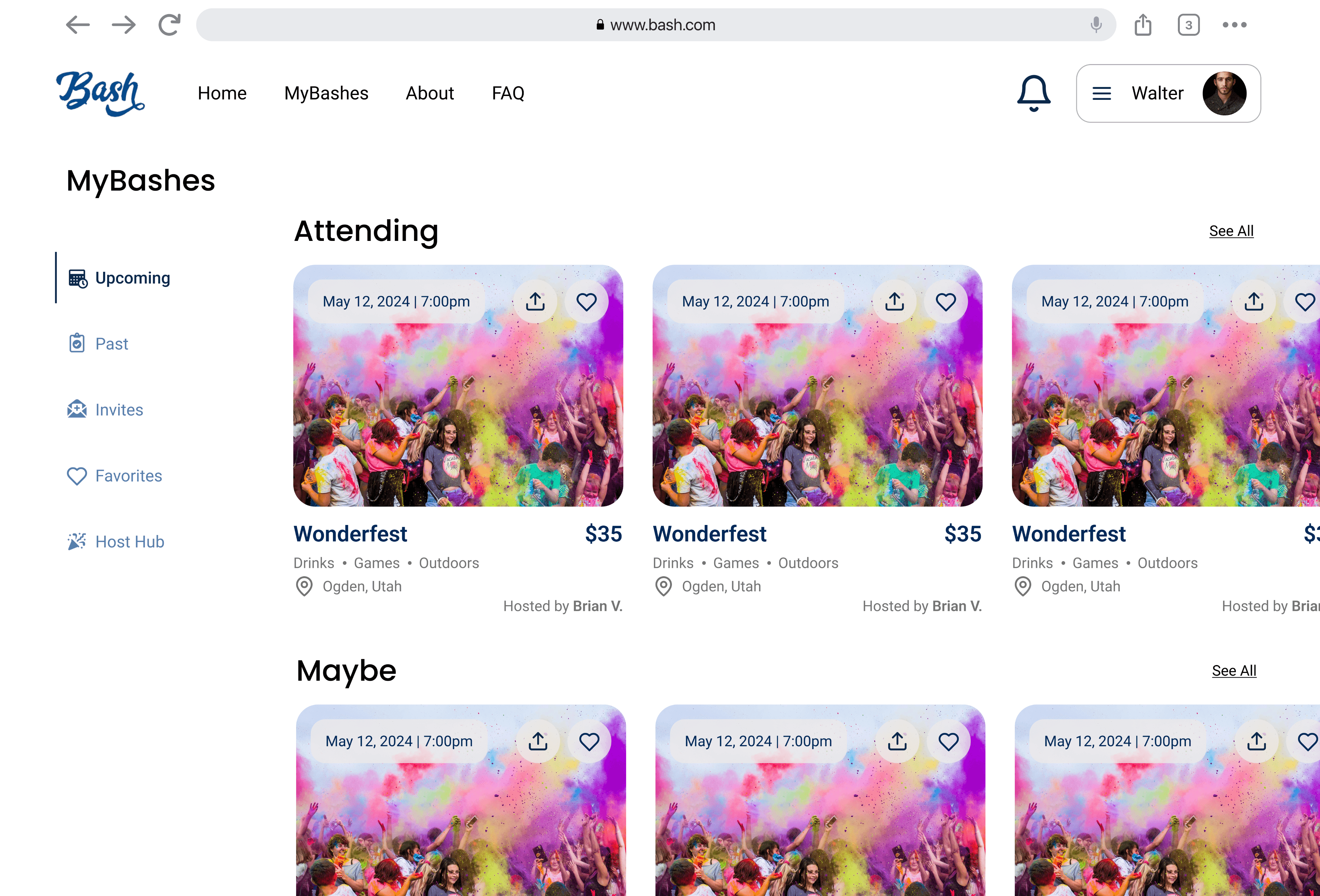
The updated MyBashes features and improved card components were presented to the client, offering two navbar position options. Bashes were grouped into Past and Upcoming categories, with additional sections for managing favorited Bashes and invitations. I also proposed creating a separate Host Hub to manage hosted Bashes more easily.
Original Design
Hi Fi Iteration 1: Side Navbar Option w/ Icons
Hi Fi Iteration 2: Top Navbar Option w/out Icons
Bumps in the Road
Redefining the Solution
hello
Sprint Context
Our team of six included four UX/UI designers (myself included), a senior design lead, and a project manager. Once the problem space was defined, the project was divided into two sprints. The first sprint focused on developing the design for the Live, Upcoming, and Past Posts features. The second sprint centered on the "Create a Post" user flow and designs for both mobile and desktop devices.
Design Sprint A
The first phase of this project involved designing user enhancement features for the client. A major challenge during this sprint was addressing the client's concerns about the effort required to move all key user interactions to the bottom navbar. Our task was to provide a solution that eased the client's apprehensions while also offering guidance for future development.
Design Sprint B
In the second sprint, I developed the "Create a Post" flow. With the addition of posts to the platform, it became essential for users to have a seamless way to create them. During this phase, I researched social media and post-sharing apps like Instagram, Snapchat, and TikTok to better understand how users can easily navigate the post creation process. I designed low fidelity wireframes and high fidelity screens, and responsive designs for mobile. Additionally, I adhered to and expanded Bash's design system to ensure a professional and consistent look across the platform.
03
Design Sprint A
Mid Fidelity Wireframes
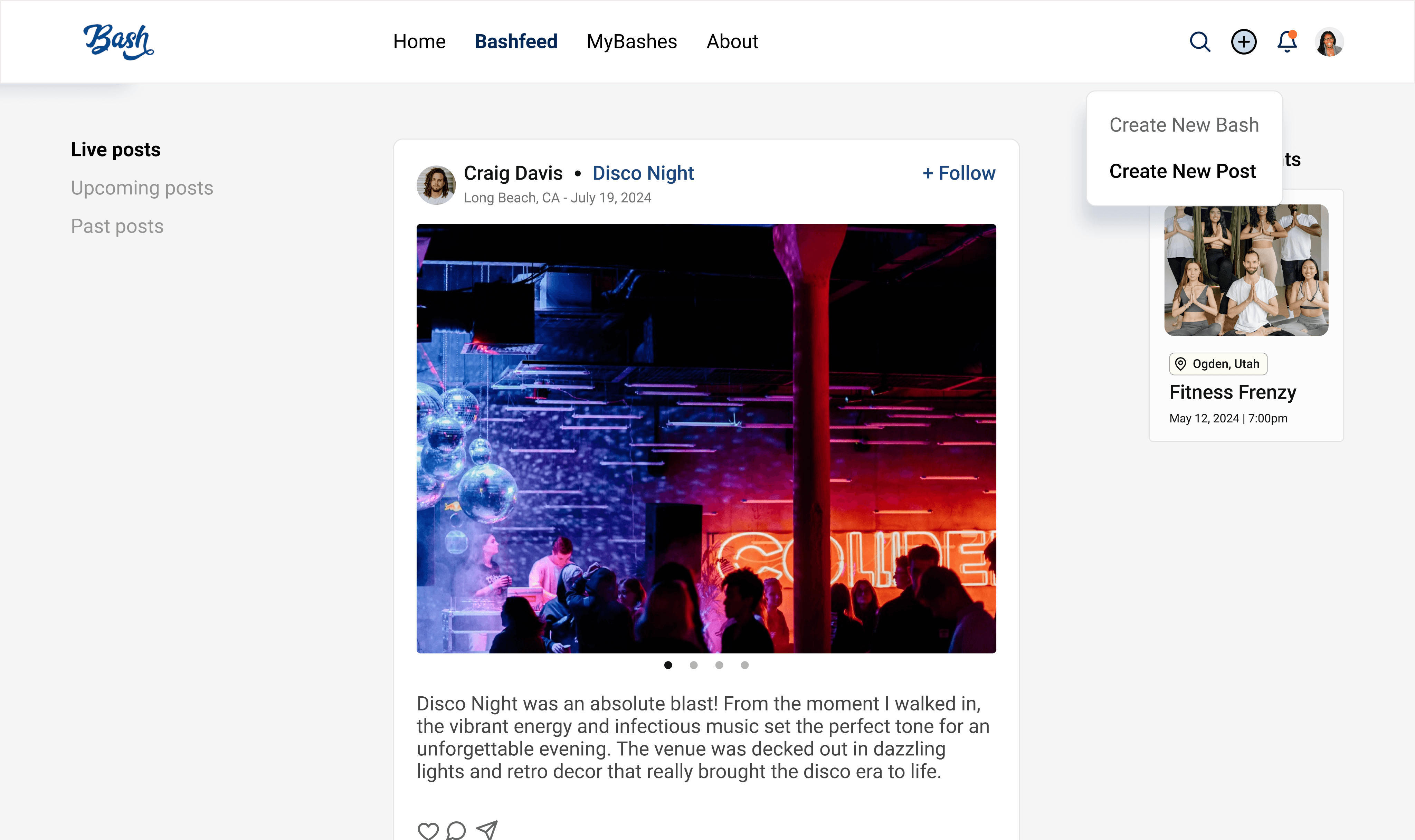
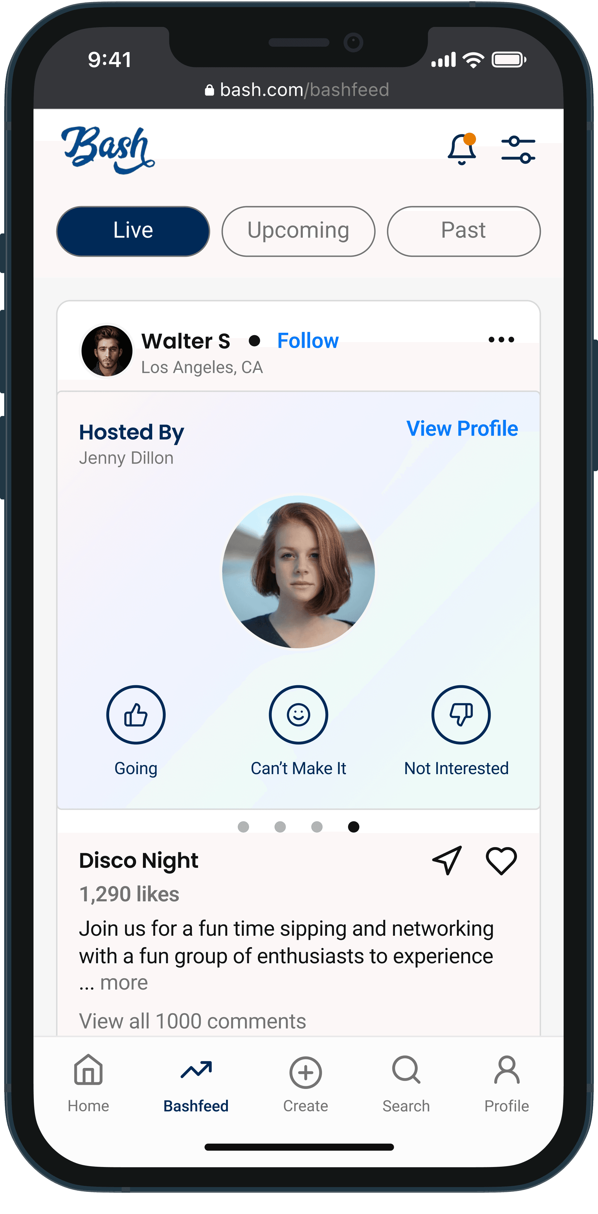
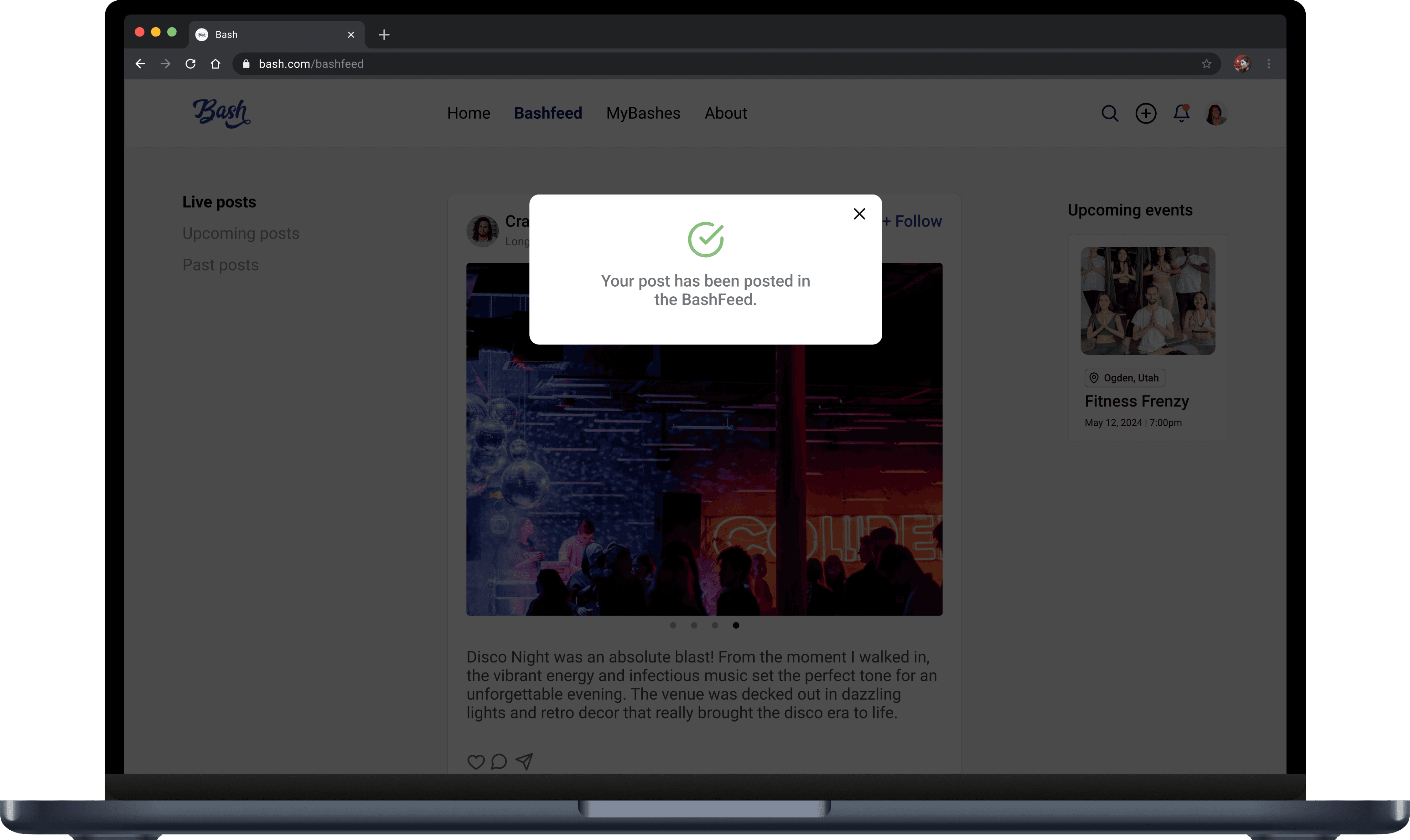
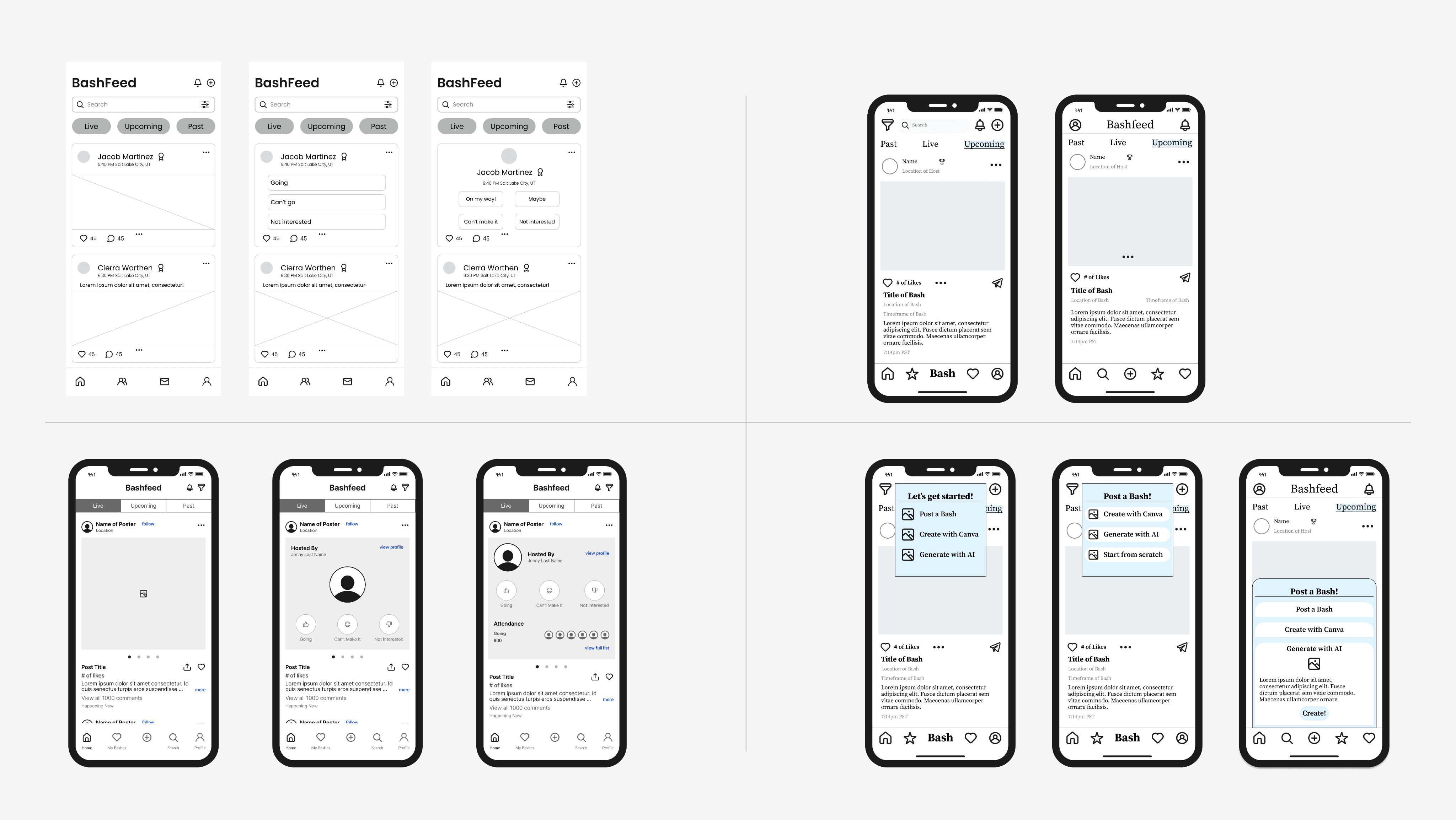
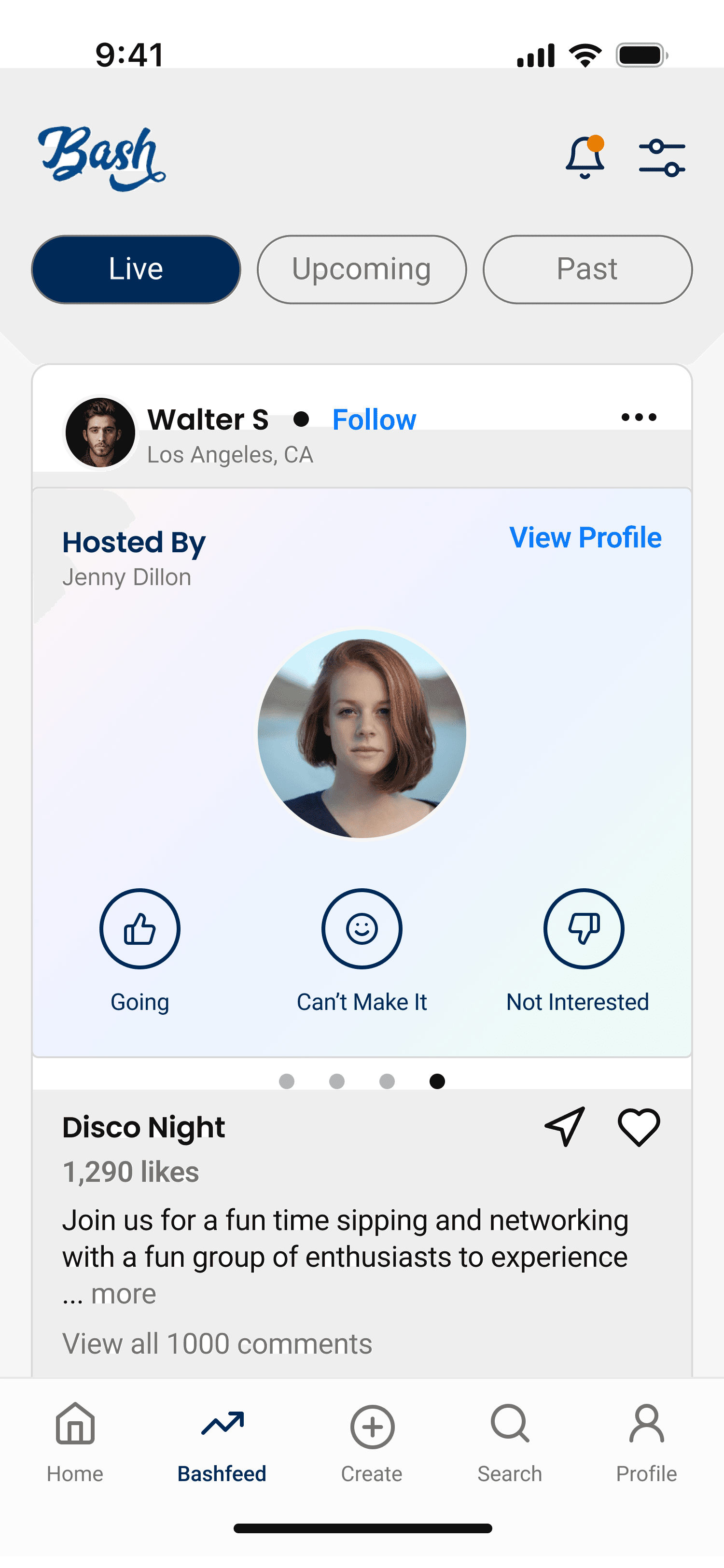
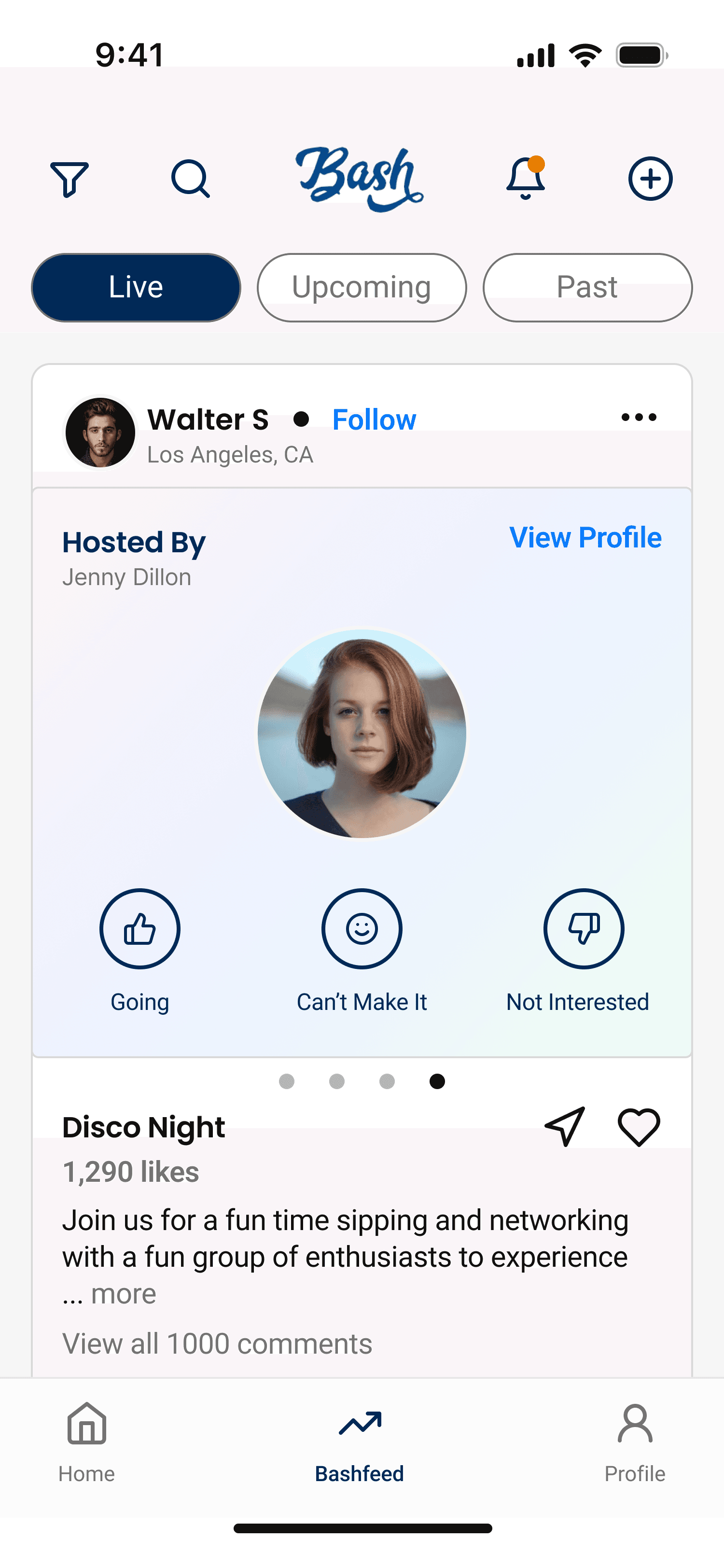
Our team swiftly created mockups for the social media Bashfeed feature, emphasizing sharing, likes, and comments, much like other social media platforms. We explored how to structure the Live, Upcoming, and Past posts, along with how to integrate the Bash and the Bash host within each post.
Balancing Resources and Design Decisions
Original Design: Homescreen Analysis
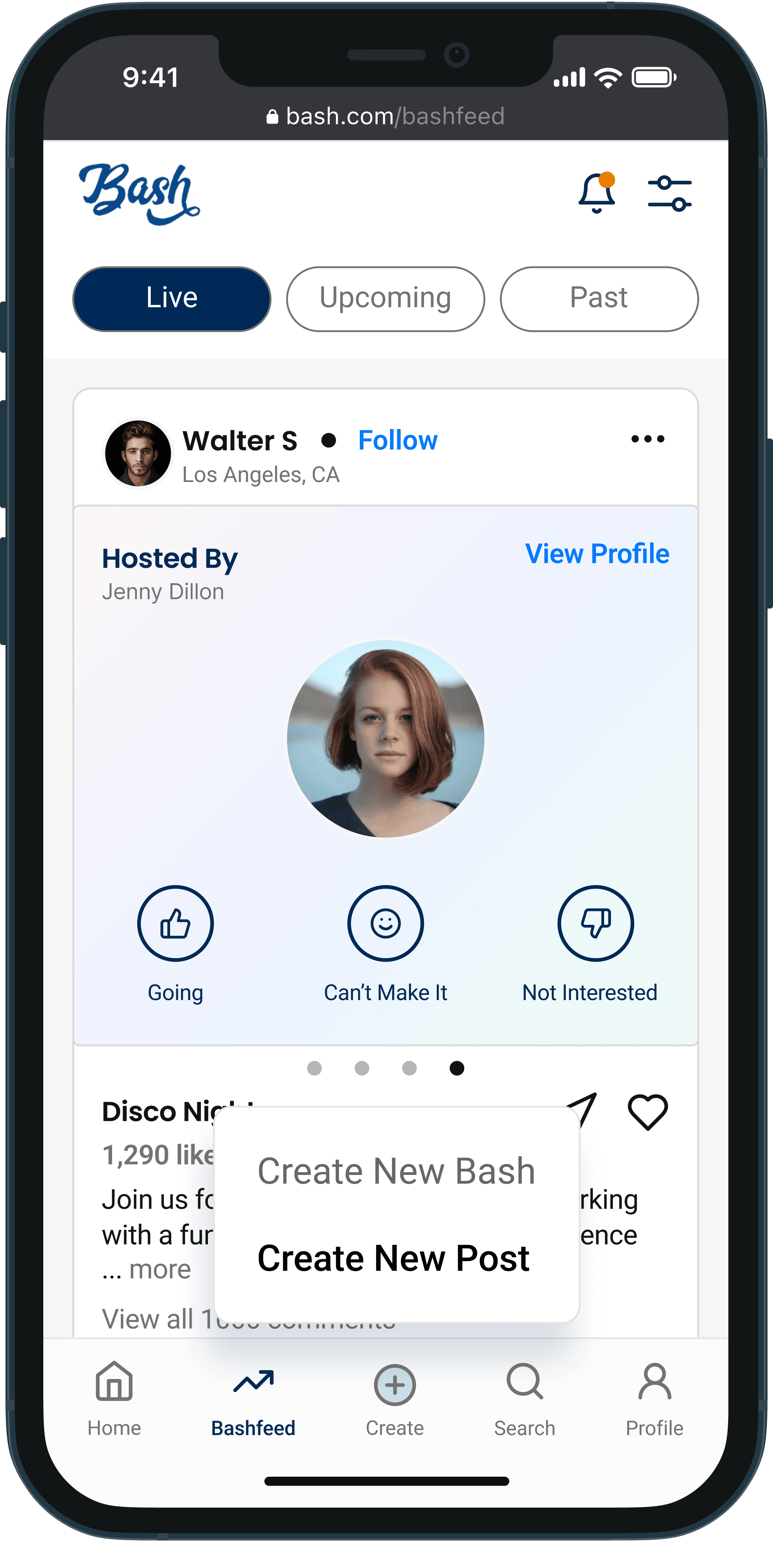
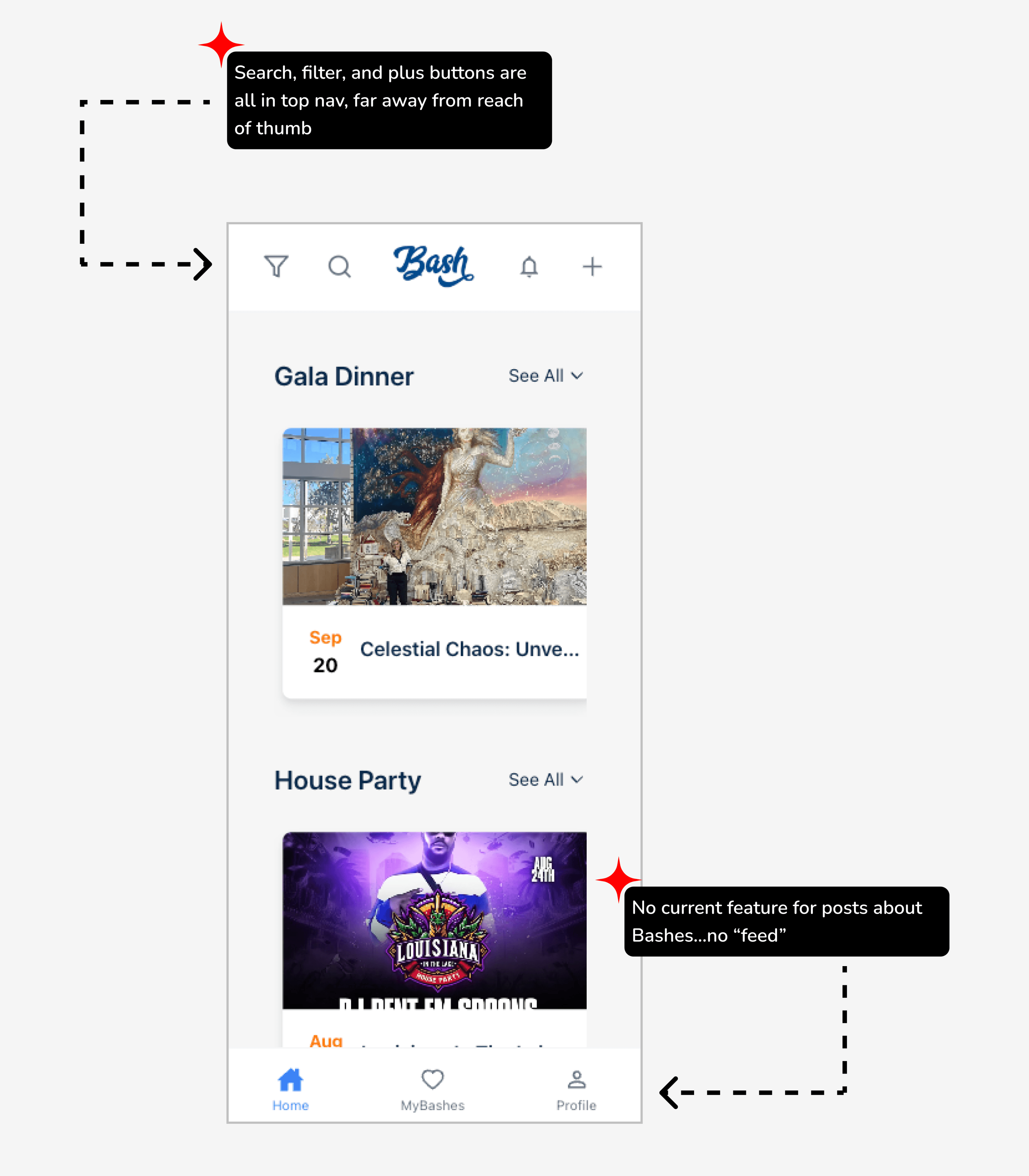
The current public design of the mobile Bash platform includes two navbars. While the client emphasized the need for Bash to function as both an event finder and a social media platform, key features like search, filter, and the plus button (for creating Bashes or posts) are located in the top navbar, making them less intuitive due to the thumb's reach, disrupting expected UX patterns. Additionally, the bottom navbar doesn't provide access to posts about Bashes, as the Home feature houses events, and MyBashes is solely for managing RSVPs.
High Fidelity Screens
04
Design Sprint B
Create a Post Flow
Gathering More Insights
Feature Research
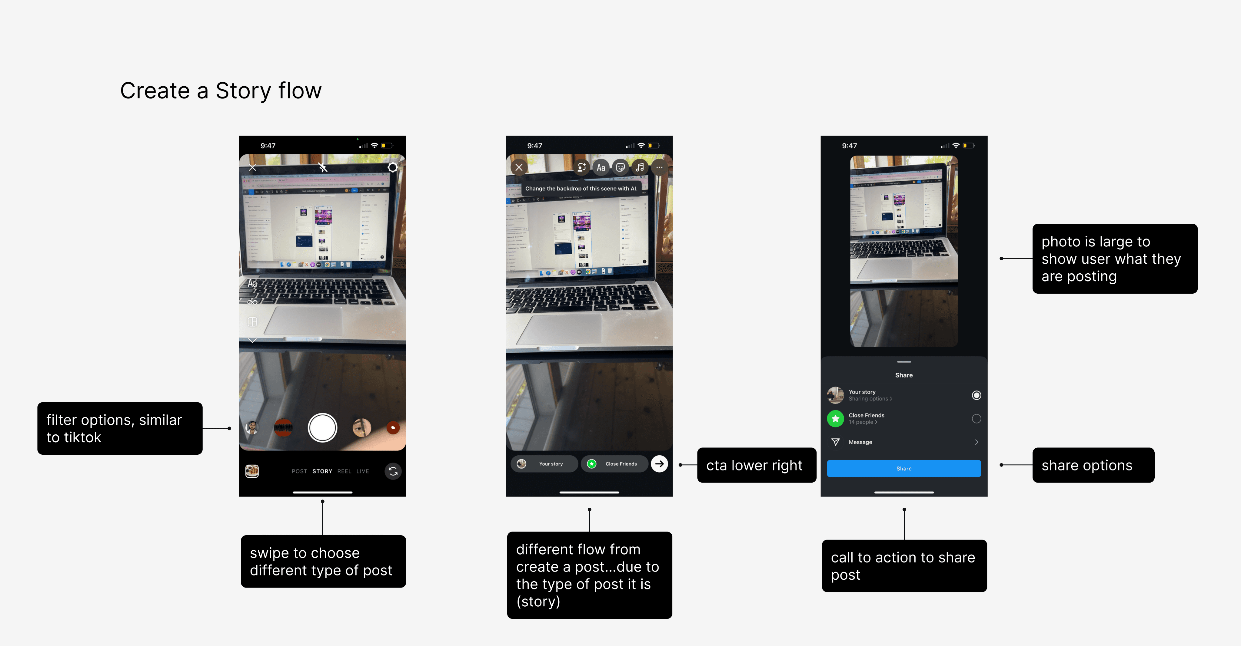
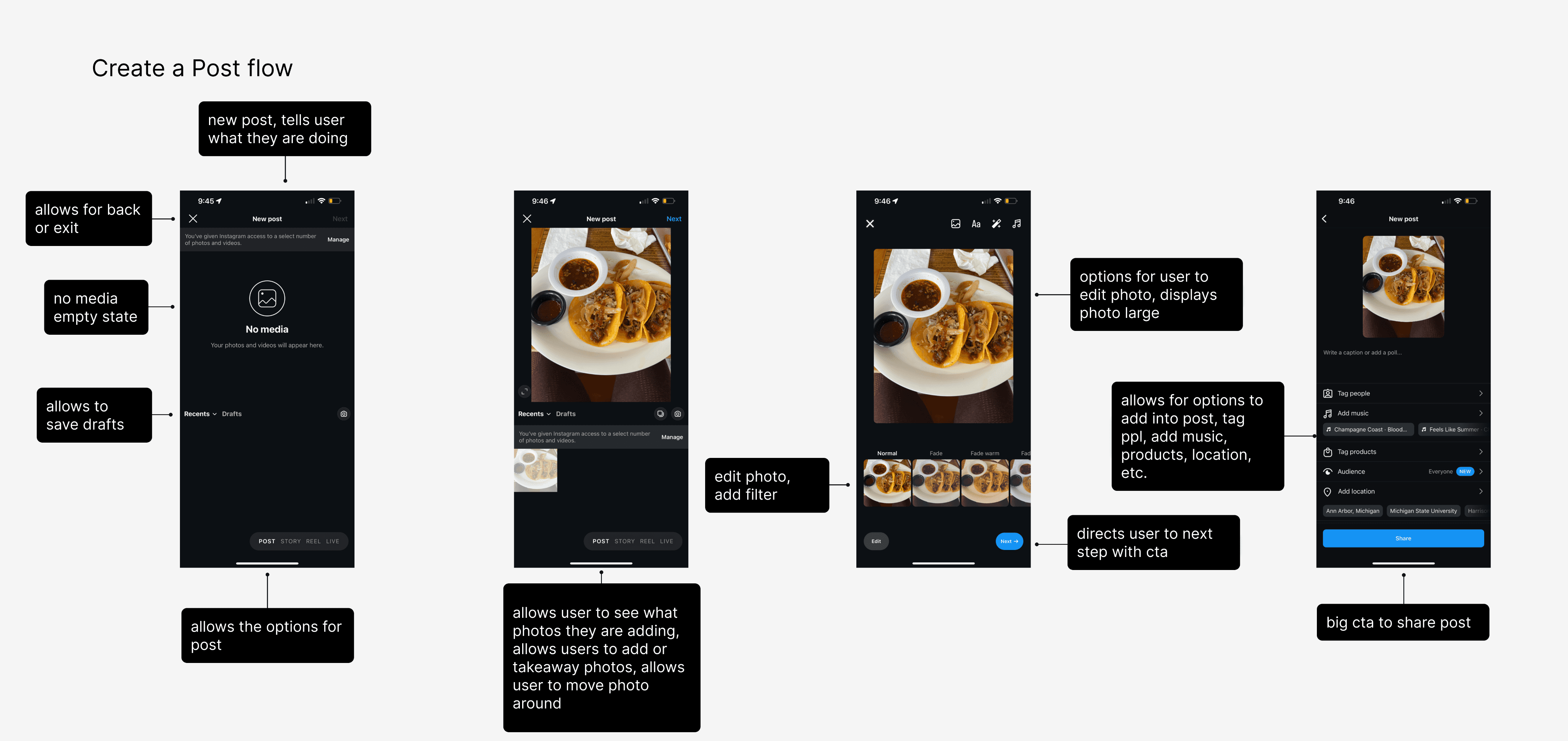
While our team was designing the Live, Upcoming, and Past posts features, I realized we needed to explore how users would interact with these features. Specifically, I questioned what the process of creating a post would look like. I began by researching Instagram's creation flows, particularly how users create stories and posts.
Key UX design features I identified include:
The creation flow guides users step-by-step through the process, from selecting photos to adding text, filters, tagging, and reviewing.
Call-to-action buttons are positioned in the bottom right to smoothly guide users to the next step.
Clear icons and labels help users navigate easily, including options to exit or save drafts if they choose to stop the process early.
Low Fidelity Wireframes
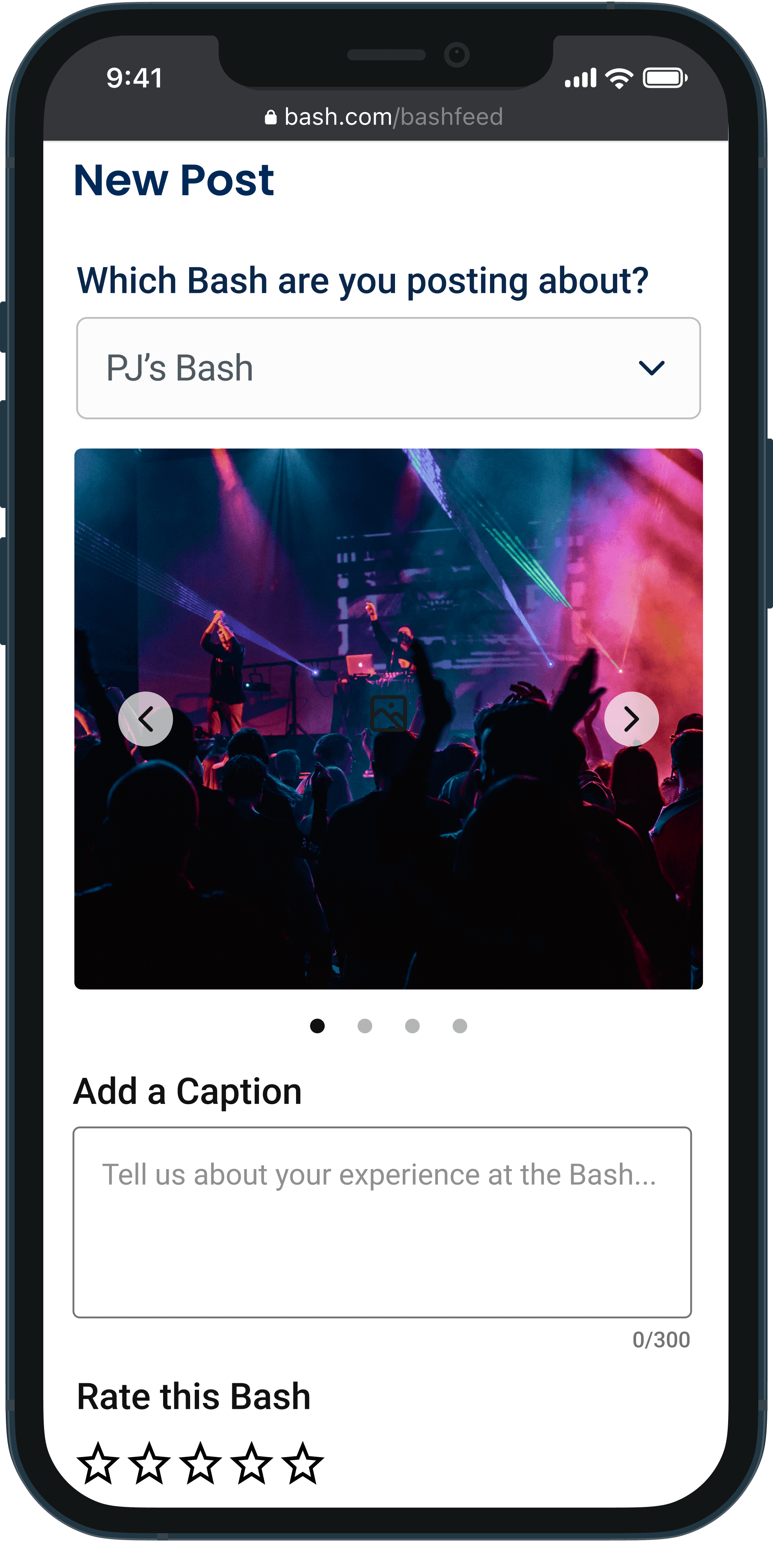
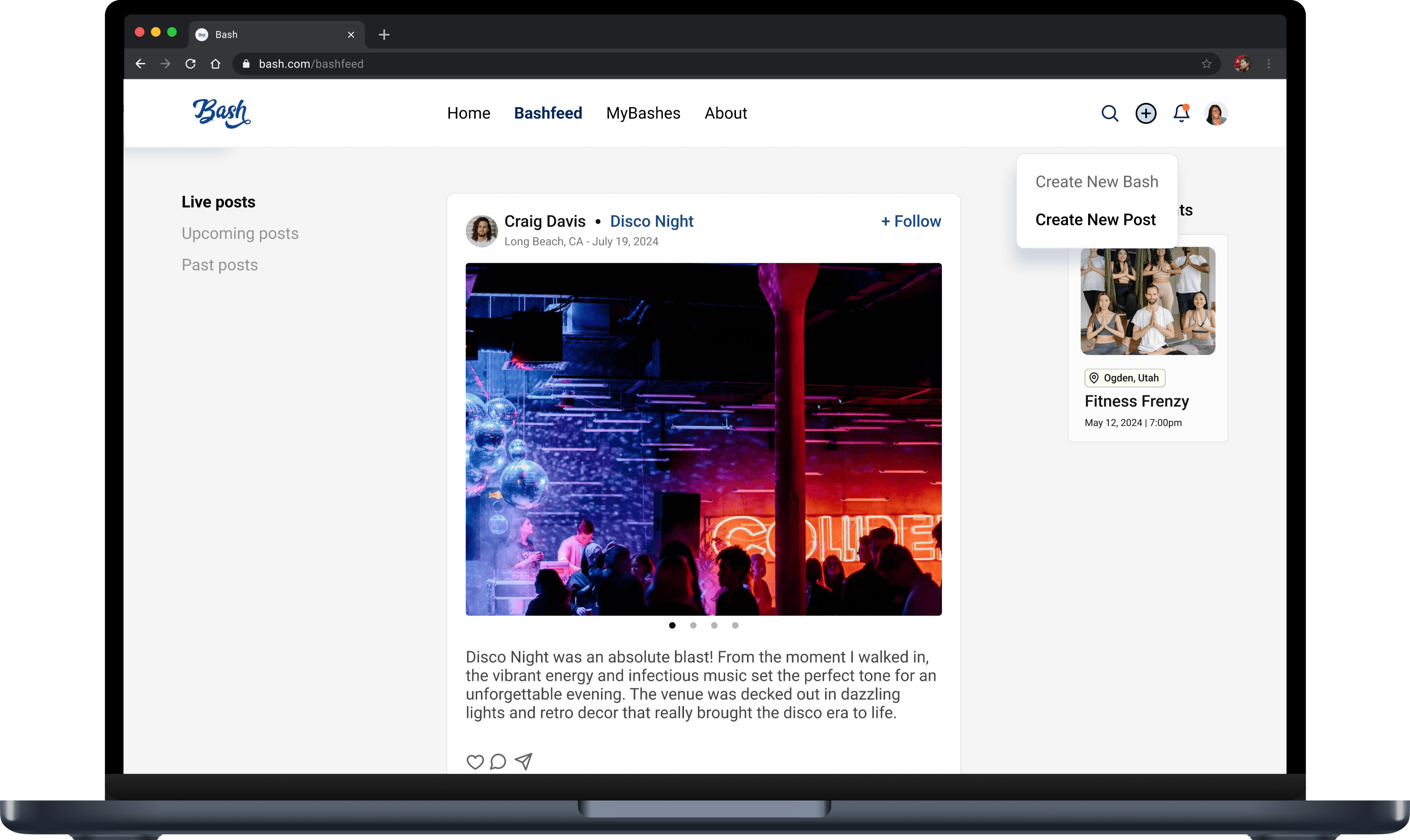
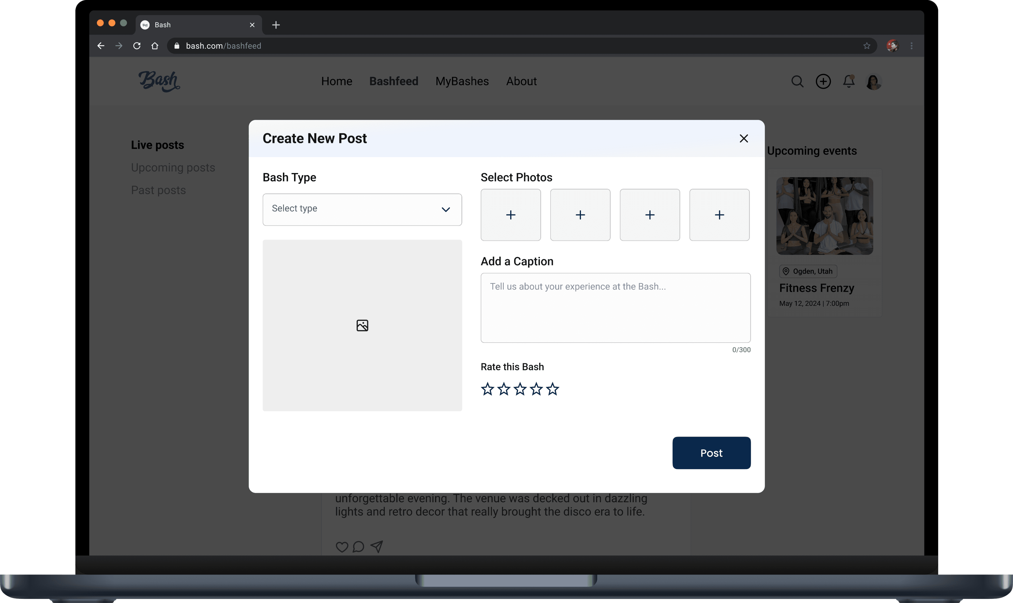
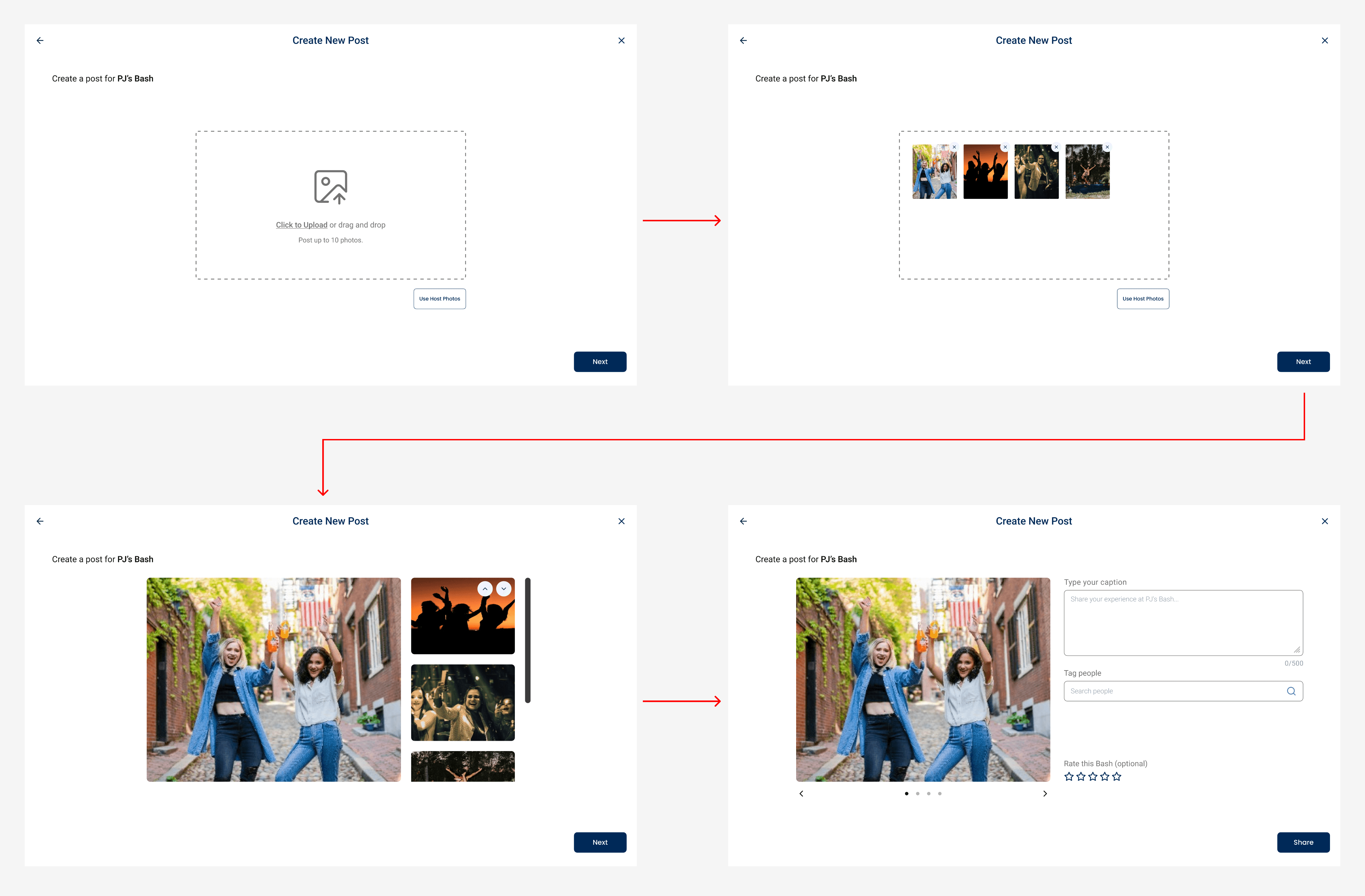
I designed low fidelity wireframes for the "Create a Post" flow, starting with the desktop version, emphasizing a guided user experience. The process begins when the user clicks the plus button, prompting them to add photos via drag-and-drop or by selecting the host's photos from the Bash. Users can then rearrange the photos, add a caption, and provide a 5-star rating—a feature the client specifically wanted to include.
High Fidelity Screens: V1
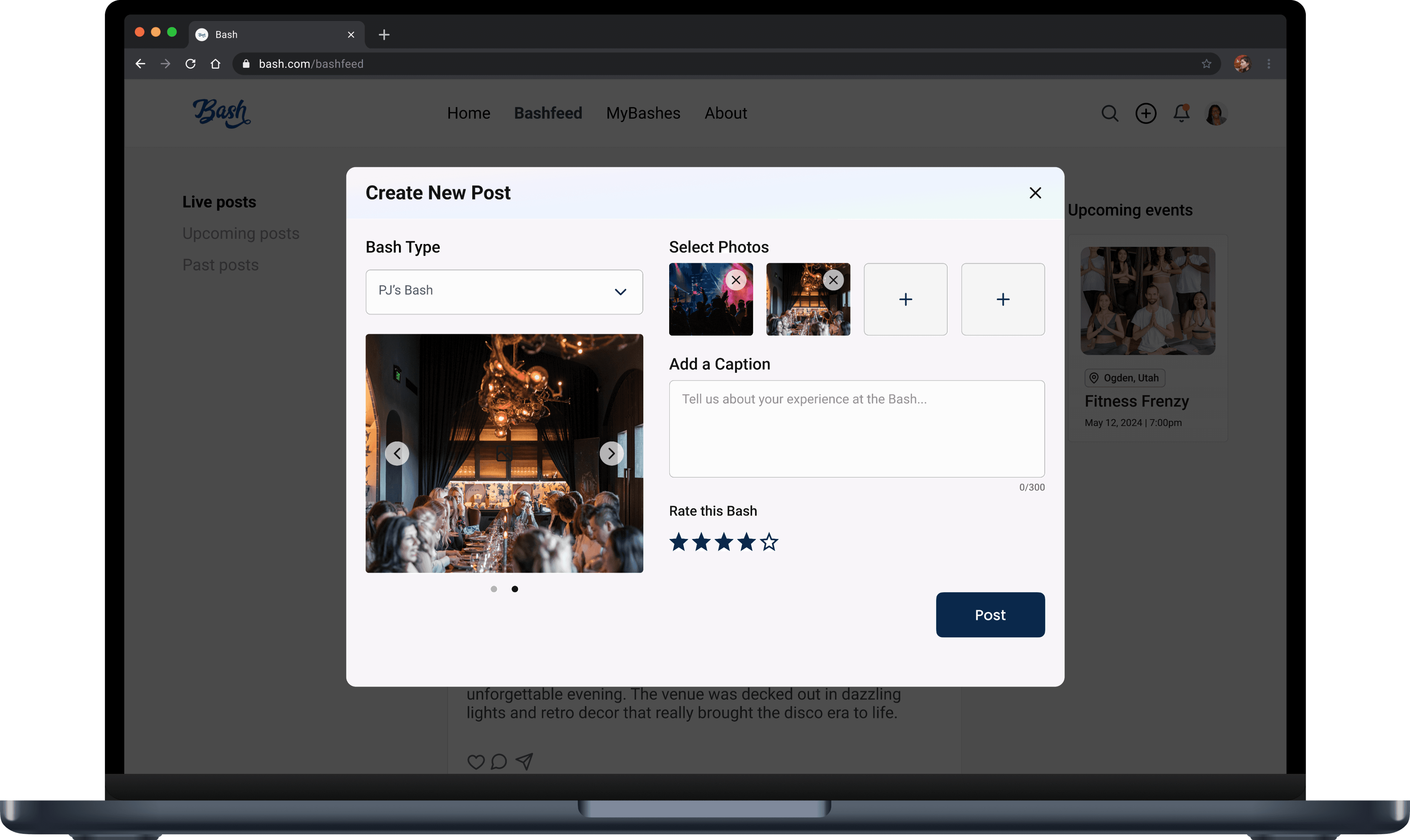
Creating the high fidelity screens for desktop gave me insight into how users might navigate the post creation process. While creating the high fidelity designs, I carefully considered the user experience at each step of the process. How would users upload their photos on a desktop? How many photos should they be allowed to add? What would the options for deleting and rearranging the photo order look like? My goal was to ensure users could navigate the process effortlessly, taking inspiration from Instagram's smooth creation flows.
Analyzing Business Needs
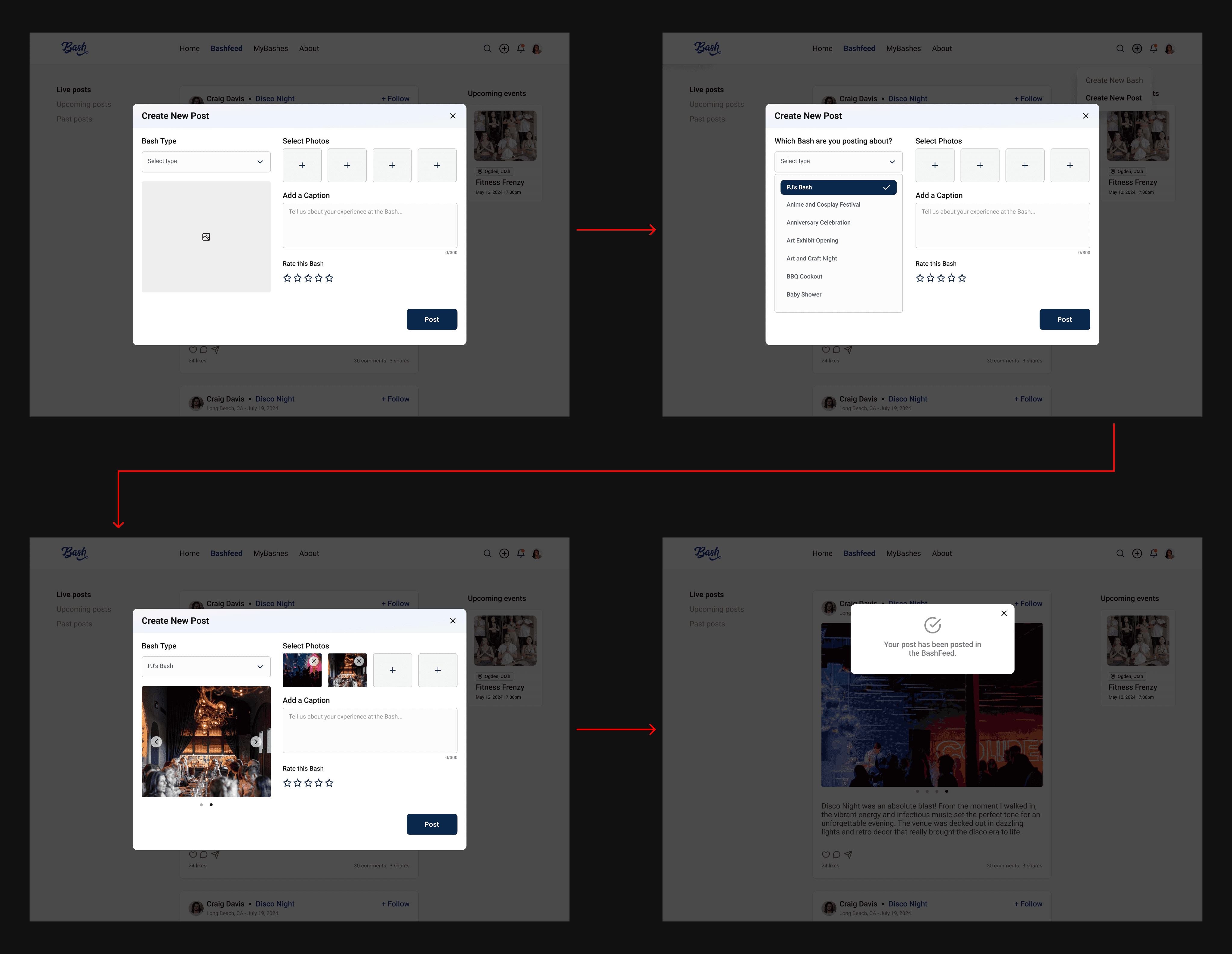
High Fidelity Screens: Final Iteration
Initially, I believed a step-by-step guide would make the journey smoother and more intuitive. However, after reviewing the high fidelity designs, I began to question whether this level of guidance was necessary. Platforms like Instagram use step-by-step flows due to the numerous features available for editing posts, catering to users who often rely on the platform for business or income. Since Bash doesn't have these complexities at this stage, such a detailed guide may not be needed.
We refined the final iteration of the "Create a Post" flow, implementing several key design changes, which included:
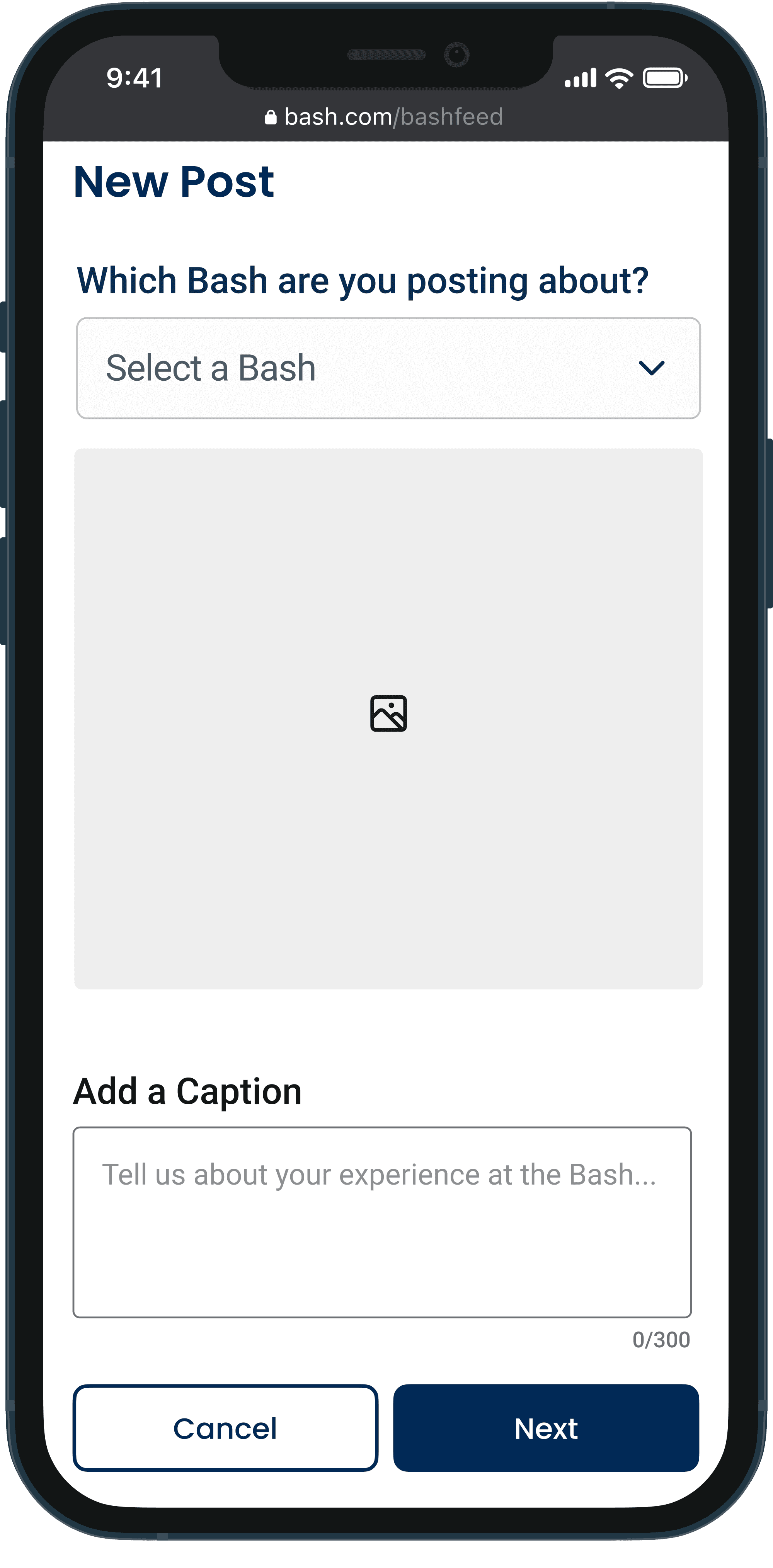
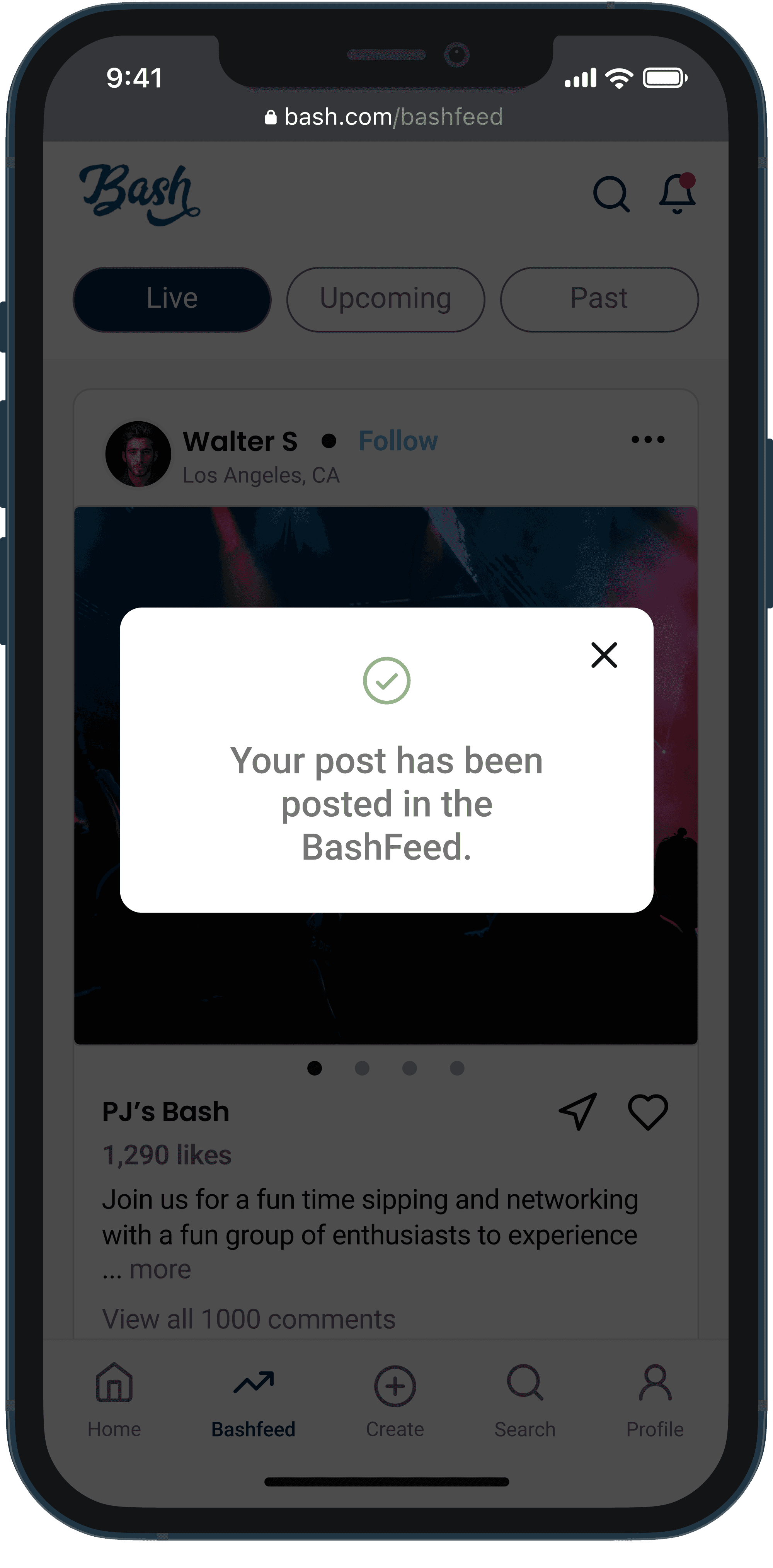
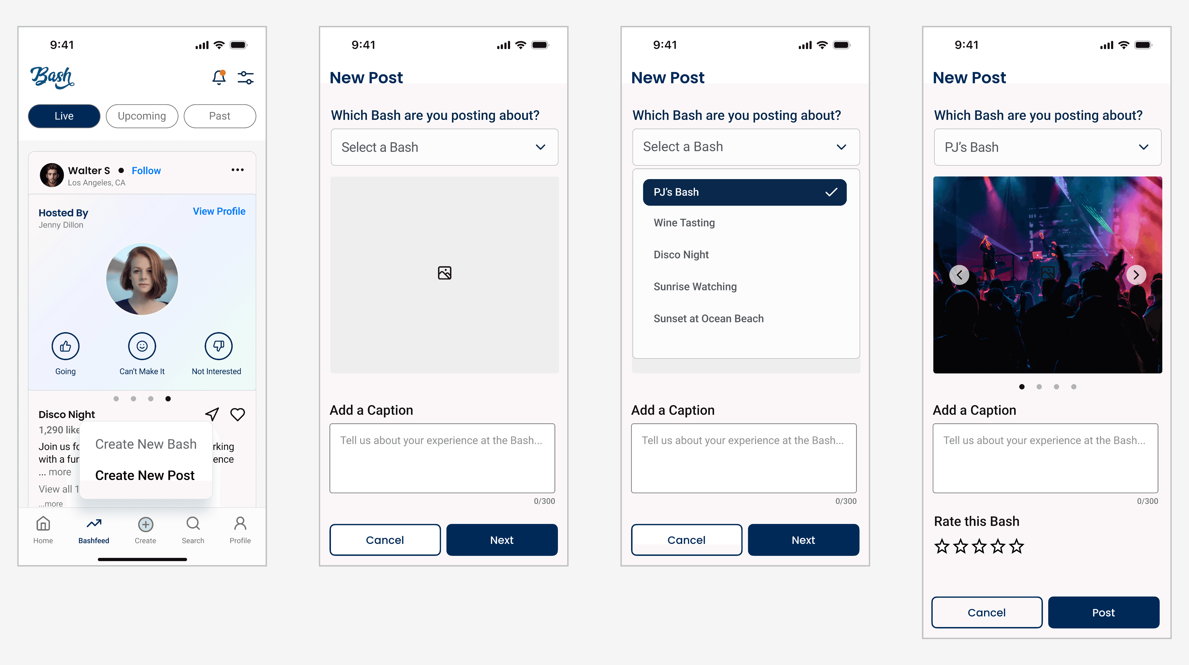
A pop-up screen that allows users to create a post within a single interface, minimizing clicks and taking into account the development effort for a more complex flow.
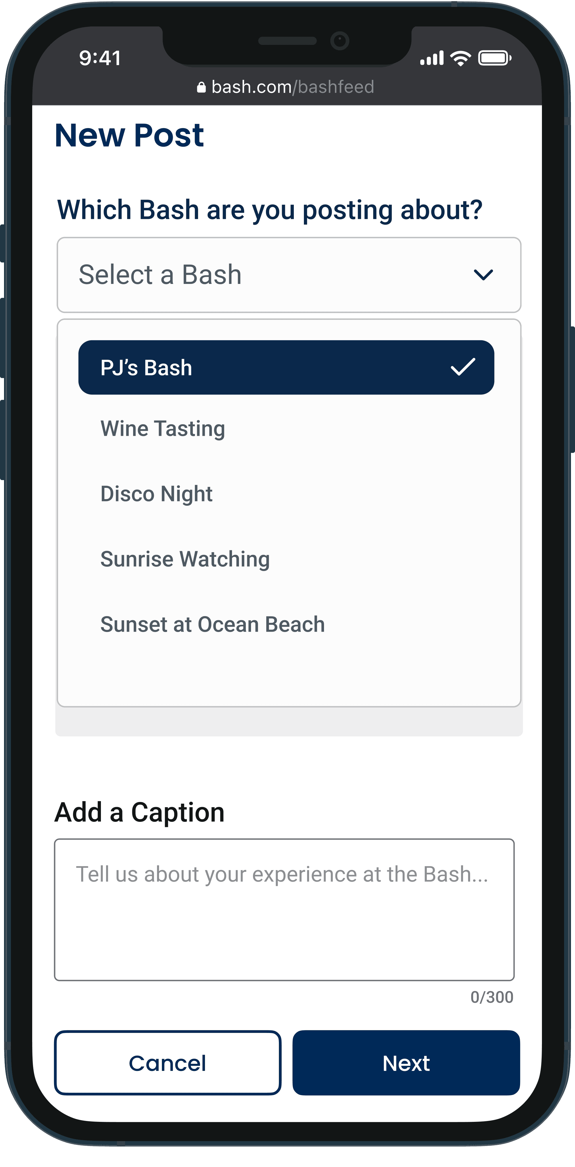
A drowdown menu for selecting which Bash the post is associated with, as users can only post about Bashes they are connected to through attendance, RSVP, or invitation. This feature reinforces user safety on the platform.
I suggested making the five-star rating system a mandatory part of the posting process rather than optional. This adds an extra layer of credibility and encourages responsible engagement from users.
Transitioning to Mobile
Responsive Design
I ensured the designs were responsive by creating the "Create a Post" flow for both mobile and desktop, maintaining consistency across platforms for a seamless user experience. Additionally, we explored how this flow would integrate with the interim design of the Bashfeed, which was developed to ease the client's engineering process.
05
Delivery
Design System
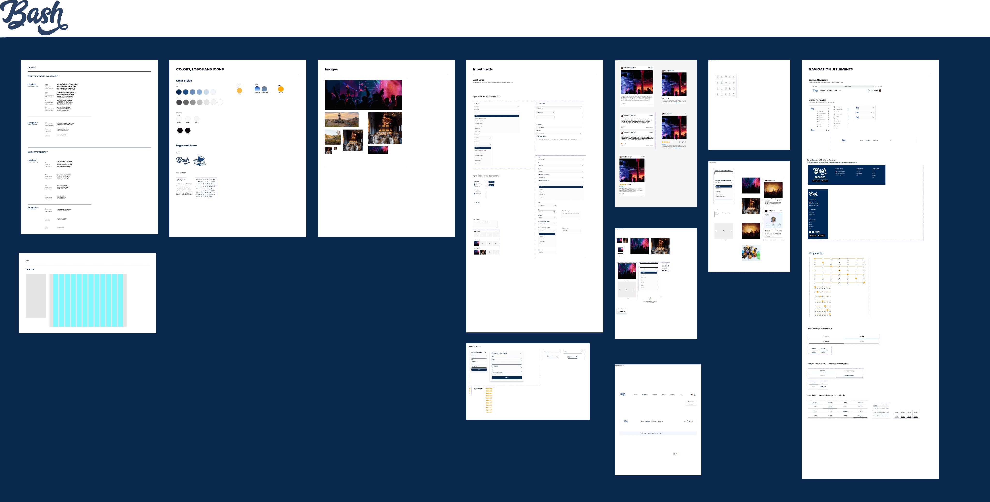
To ensure consistency with future design updates and solutions, we maintained a well-organized and updated design system. Bash's existing complex design system was expanded with our new designs, which we consistently referenced to maintain a cohesive and professional look across the platform.
Prioritizing a seamless developer handoff, we leveraged Figma's platform for our single source of truth. This allowed us to keep all design components organized, ensuring that the development team could easily implement our designs.
Reflection
Navigating innovation and expectations
The importance of balancing innovation with user familiarity was a lesson learned during this project. While it was exciting to introduce new features like the Live, Upcoming, and Past posts, I learned that keeping the user experience intuitive and consistent with industry standards is crucial for adoption. Understanding when to push creative boundaries and when to rely on established UX patterns is a valuable lesson in designing.
Expanding social media potential
Although we were limited on time and resources for this project, I'm eager to further develop Bash's social media features. While we focused on creating the minimum viable product, it's intriguing to consider how the user experience could be enhanced with post-editing options. Also, with the rising popularity of stories on social media, how could we incorporate this feature to stay current with industry standards?
Exploring more user journeys
Additionally, I would have liked to explore the differences in the user journey for Past and Upcoming posts more thoroughly. How would users create a post for an Upcoming Bash? Would there be restrictions on posting about Past Bashes? How could users organize their feeds and share posts with others? These questions emerged during the project, and I would have enjoyed the opportunity to delve deeper into them.

