2024

Genee

Navigating crossroads with confidence - career coaching designed for women ready to take the leap towards positive change.

2024

Genee

Navigating crossroads with confidence - career coaching designed for women ready to take the leap towards positive change.

2024

Genee

Navigating crossroads with confidence - career coaching designed for women ready to take the leap towards positive change.

Overview

Genee is a science-based coaching platform dedicated to empowering women in their quarter- to mid-life stages as they navigate life's pivotal decisions. Using a coaching framework rooted in psychology and behavioral science, combined with new AI technology, Genee provides holistic guidance that fosters growth and resilience.


Research shows that women in their mid-career life, often from the ages of 30 to 55, face a unique set of challenges, including balancing personal and professional aspirations and finding fulfillment in their lives. Genee bridges this gap between struggle and success. By focusing on four key areas—career and money, relationships, health, and enjoyment—Genee equips women with the confidence and tools to achieve their goals through actionable mindset shifts and targeted progress strategies.

Role

UX/UI Designer

Tools

Figma, FigJam, Slack, Monday, Google Suite, Loom

Process

Discovery, Define, Design Sprint A, Design Sprint B, Delivery, Reflection

The Problem

Before rebranding as Genee, the company operated under the name Elevate, with the website coachwithelevate.com. However, as the business grew, they encountered significant SEO challenges due to another company with the same name. Recoginizing the need for a unique identity to support their growth, Genee's CEO initiated a rebranding process. Our mission was to redesign their existing website to reflect and align with their new brand identity.

Before rebranding as Genee, the company operated under the name Elevate, with the website coachwithelevate.com. However, as the business grew, they encountered significant SEO challenges due to another company with the same name. Recoginizing the need for a unique identity to support their growth, Genee's CEO initiated a rebranding process. Our mission was to redesign their existing website to reflect and align with their new brand identity.

Before rebranding as Genee, the company operated under the name Elevate, with the website coachwithelevate.com. However, as the business grew, they encountered significant SEO challenges due to another company with the same name. Recoginizing the need for a unique identity to support their growth, Genee's CEO initiated a rebranding process. Our mission was to redesign their existing website to reflect and align with their new brand identity.

The Solution

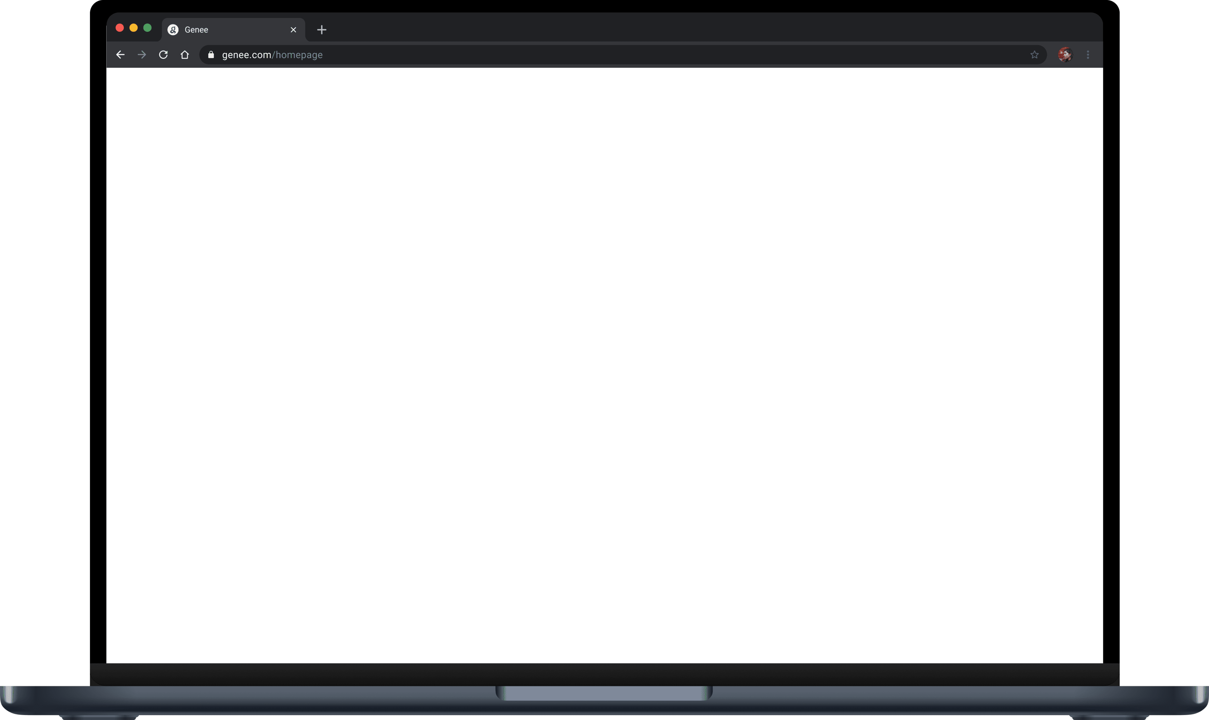
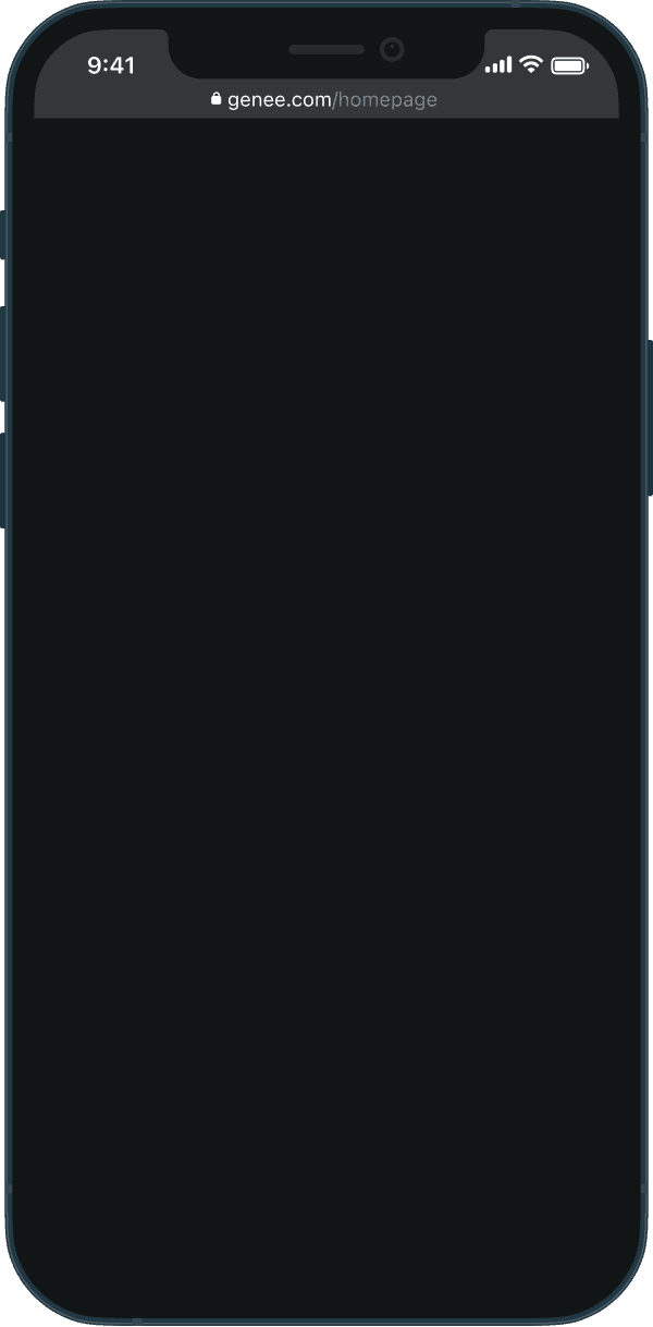
Our team designed a fully responsive website that seamlessly aligned with Genee's new brand identity. Our solution required balancing the client's business vision with the needs of the target audience: mid-life women seeking guidance, clarity, and support. By deeply empathizing with these users, we gained insights into their priorities and designed a website that addressed their aspirations while effectively supporting Genee's mission. Through close collaboration with the client, we delivered a thoughtfully crafted final product, ready for development, that reflects both the brand's values and its users' goals.

Our team designed a fully responsive website that seamlessly aligned with Genee's new brand identity. Our solution required balancing the client's business vision with the needs of the target audience: mid-life women seeking guidance, clarity, and support. By deeply empathizing with these users, we gained insights into their priorities and designed a website that addressed their aspirations while effectively supporting Genee's mission. Through close collaboration with the client, we delivered a thoughtfully crafted final product, ready for development, that reflects both the brand's values and its users' goals.

Our team designed a fully responsive website that seamlessly aligned with Genee's new brand identity. Our solution required balancing the client's business vision with the needs of the target audience: mid-life women seeking guidance, clarity, and support. By deeply empathizing with these users, we gained insights into their priorities and designed a website that addressed their aspirations while effectively supporting Genee's mission. Through close collaboration with the client, we delivered a thoughtfully crafted final product, ready for development, that reflects both the brand's values and its users' goals.

Scroll high fidelity screen to view full image.

Scroll high fidelity screen to view full image.

01

Discovery

Client Kickoff

Before we dive in...

We began the project with a client kickoff meeting to establish clear communication among the design team, senior designer, project manager, and client. During this meeting, we conducted a thorough review of the rebranding process from Elevate to Genee to fully understand the company's mission and the CEO's vision. The client provided a detailed questionnaire and company brief, which outlined their values, target users, and product descriptions. The client also shared a video recording discussing the motivations behind the rebranding and their desired design direction. Additionally, the team received branding materials, including mood boards, style guides, colors, fonts, and Genee's new logo in PDF and vector formats to help shape our design process.

Competitive Analysis

Research: Annotated Inspirations

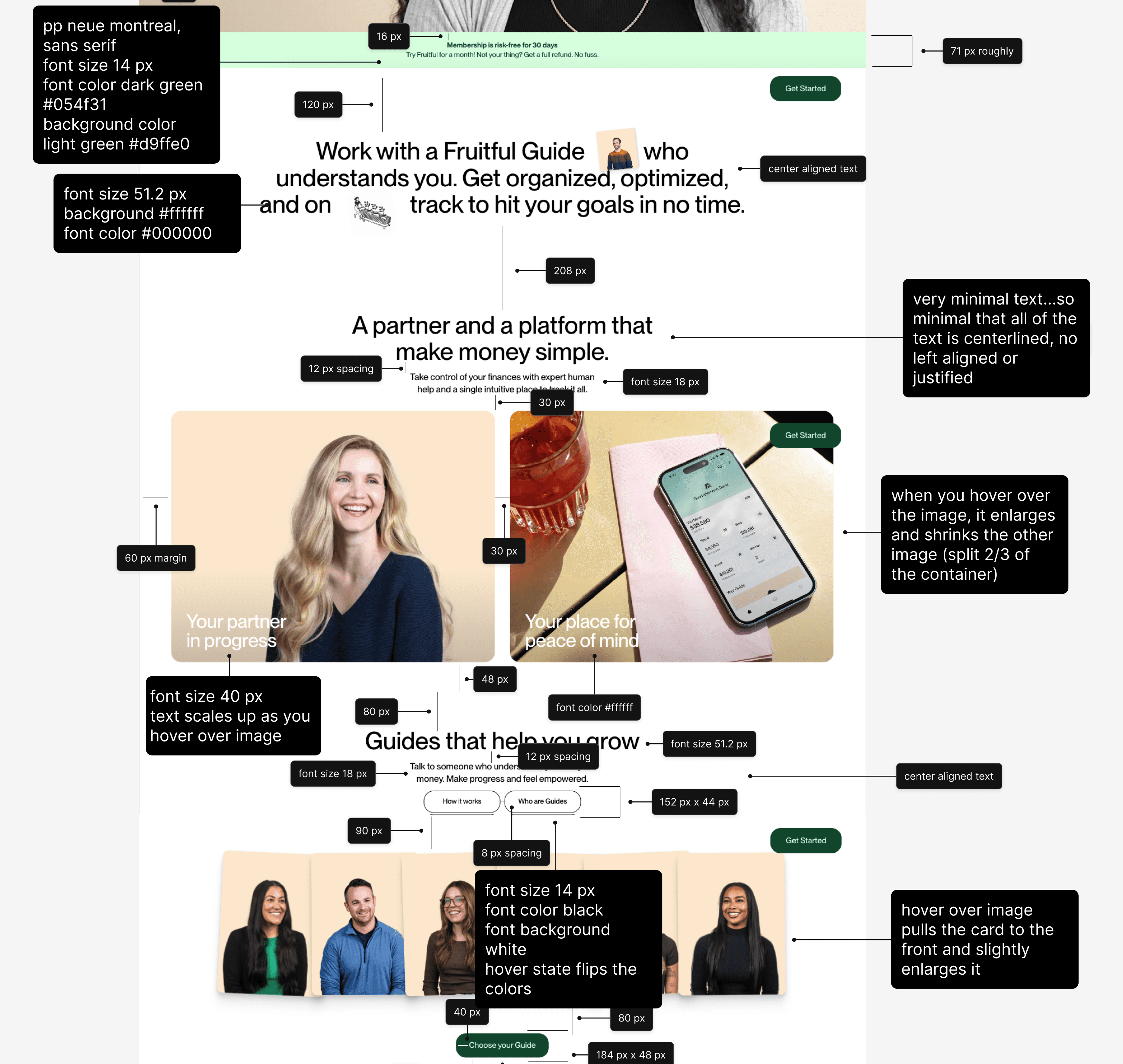
To begin the design process for Genee, my team and I were tasked with researching and analyzing design inspirations to understand the client's vision and determine the look and feel they wanted for their website. The client provided a curated list of websites they admired, each accompanied by notes explaining what they liked and how these sites inspired them. One standout website was Fruitful.com, which the client particularly loved. I conducted an in-depth analysis of Fruitful, annotating its design elements and functionality…


  • Engaging design - Fruitful has a minimalist layout with a neutral color palette, accented by one or two contrasting colors to draw attention.

  • Micro-animations - Thoughtful animations adds interactivity and keeps users engaged, a feature the client wanted to incorporate into Genee.

  • Responsive design - Elements stack seamlessly on smaller screens, maintaining a clean and functional layout.

  • Typography adjustments - Font sizes scale effectively across devices, ensuring readability on mobile and tablet screens.

  • Consistent Spacing - Margins, padding, and spacing appeared to follow the 8-pixel rule, a guideline we also planned to implement for Genee to ensure consistency and visual balance.

Organizing the Data

Research: User Affinity Mapping

The Genee team conducted an extensive research study by surveying over 130 women aged 30 to 55 and older. The goal of the survey was to uncover the unique challenges women face in their careers and how these difficulties influence their daily lives. Questions like "What is your biggest career challenge?" and "What does success after coaching look like for you?" along with open-ended responses provided a wealth of qualitative data to refine Genee's coaching framework. The survey results were shared with the design team and proved extremely insightful in helping me understand the struggles and goals of mid-career women, and how to best design a platform that truly supports them. However, the data was presented in a lengthy Excel file, making it challenging to interpret.

So much data…

So much data…

So much data…

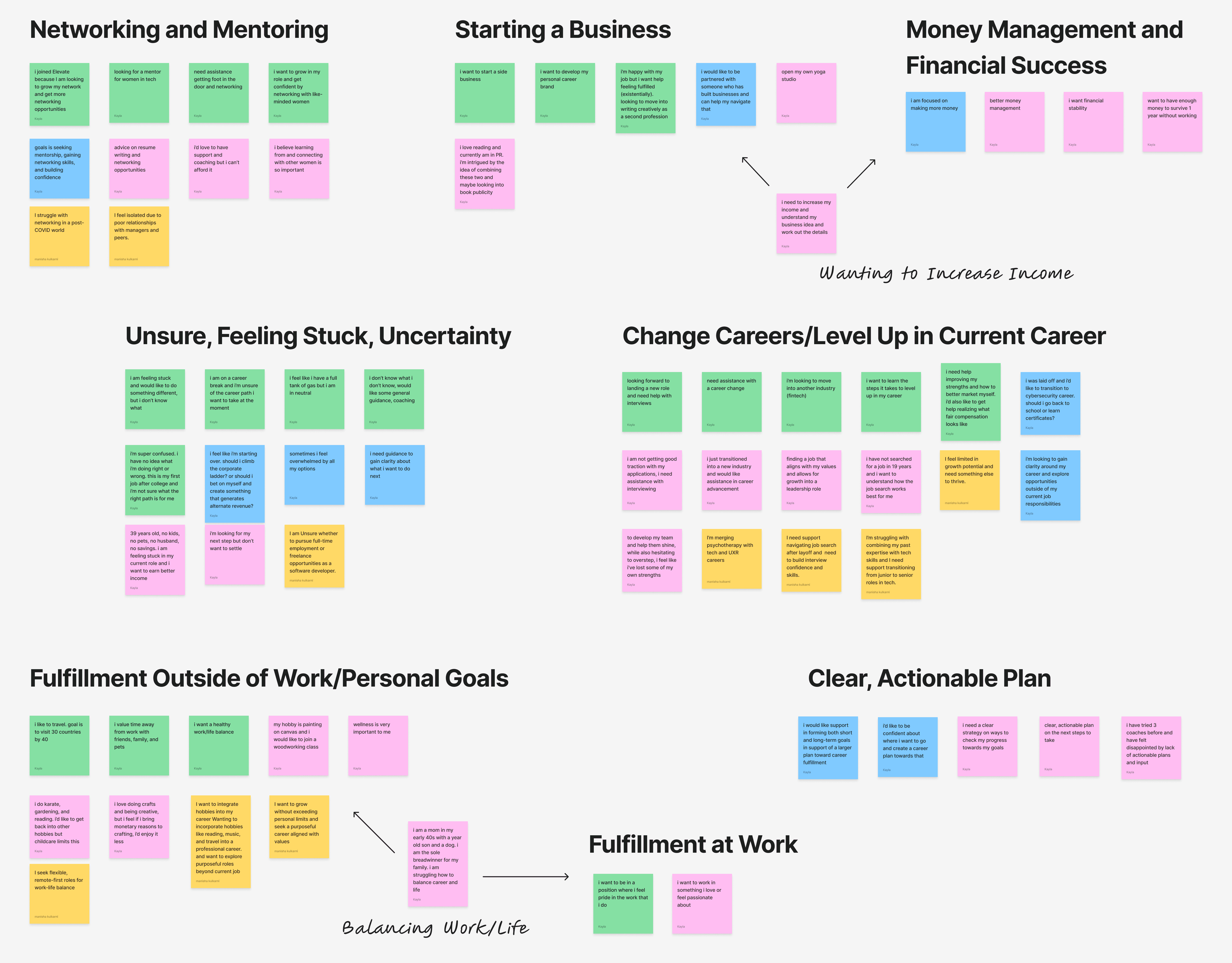
I recognized the importance of truly understanding our users' motivations, challenges, and reasons for turning to Genee. Using AI and ChatGPT, I organized the survey data to identify common categories and pain points. I then created a user affinity map to visually structure this information, which was a crucial step in helping me create a user persona for Genee. Organizing and evaluating the data like this allowed me to better understand the type of person entering Genee's platform and informed our design decisions moving forward.


I identified three key takeaways after analyzing the research and affinity map:

Addressing feelings of uncertainty

The survey revealed that most women felt stuck in their current career paths, unsure whether to continue in their fields or make a switch. I noticed a strong connection between the two issues—uncertainty often led women to consider a career change, believing it might help them overcome their stagnation. This insight highlighted a critical need to address not just career transitions but also the underlying feelings of being stuck.

Diversity in life circumstances

The women surveyed came from varied backgrounds—some were newly married, others single-income earners, mothers, or recent graduates. This diversity underscored the importance of designing Genee's platform to be inclusive and adaptable, catering to women with different experiences and needs.

Time is not the barrier

I expected that lack of time would emerge as a primary concern, with women struggling to find the time for self-improvement. However, most women expressed a willingness to set aside time for personal growth. The challenge lay in knowing where to start. This finding suggested that Genee's website could incorporate detailed and engaging elements, rather than overly simplifying content to save time.

02

Define

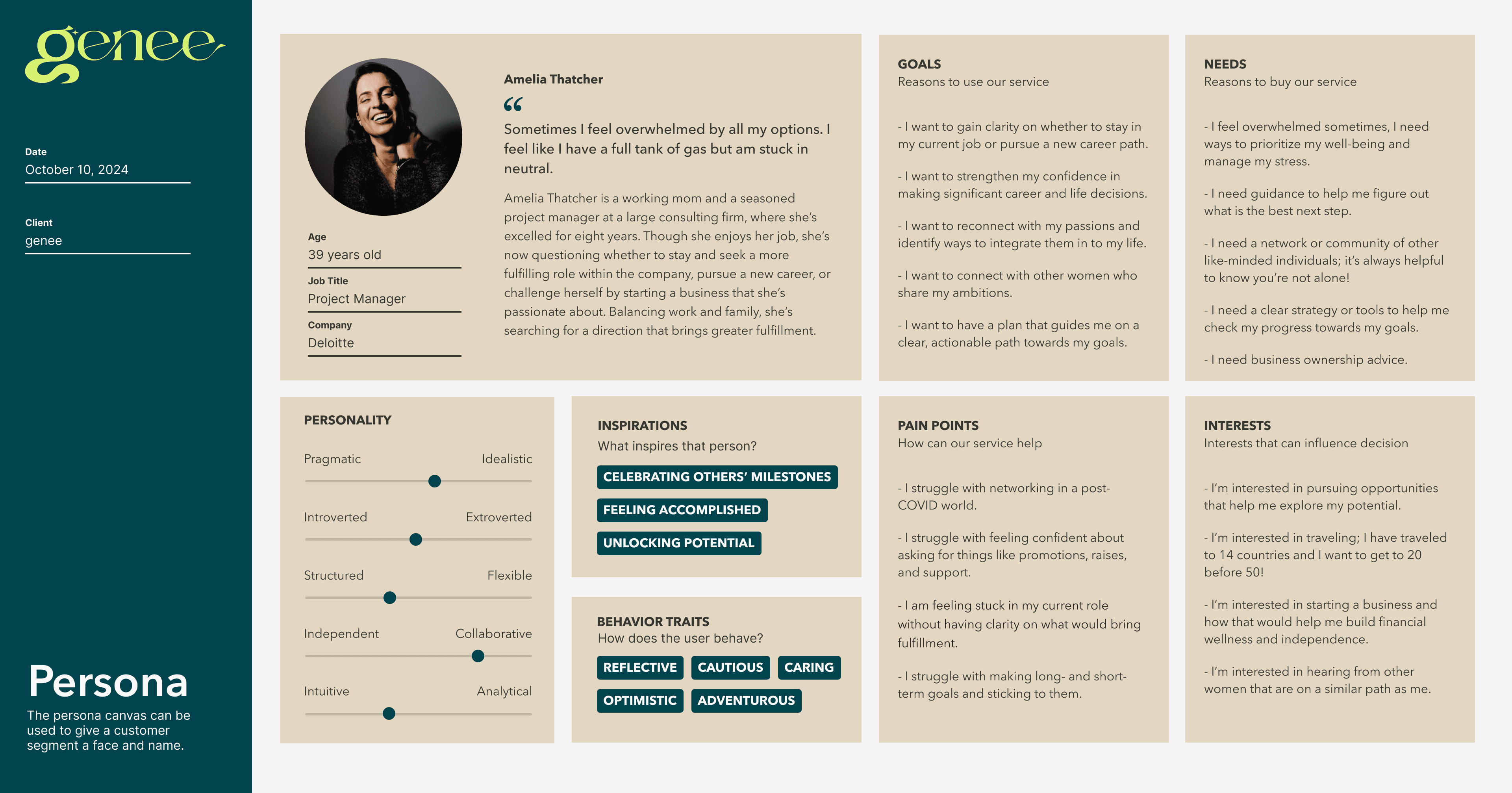
User Persona

Using the insights gathered from the user affinity map, I created a detailed user persona to guide our design process for Genee. This persona was essential for us because it encompassed all of the data from Genee's research into a single representative user, allowing us a central reference point to refer back to when making our design decisions. I considered the user's age, occupation, emotions, decision-making patterns, interests, and goals to ensure the persona accurately reflected Genee's target audience.

Sprint Context

Our team of six, comprising four UX/UI designers (including myself), a senior design lead, and a project manager, worked in an Agile environment divided into two sprints. The first sprint focused on designing Genee's desktop homepage. After presenting the designs and incorporating client feedback, we finalized the iterations and progressed into the second sprint. This phase leveraged Figma's design system tokens and variables to develop a fully responsive website for tablet and mobile devices.

Design Sprint A

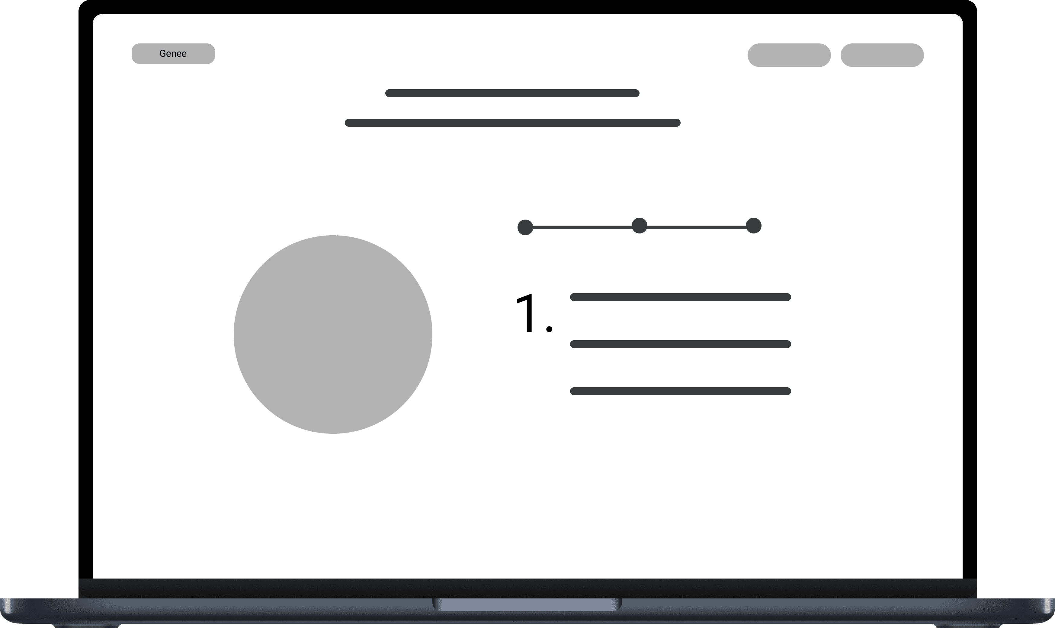
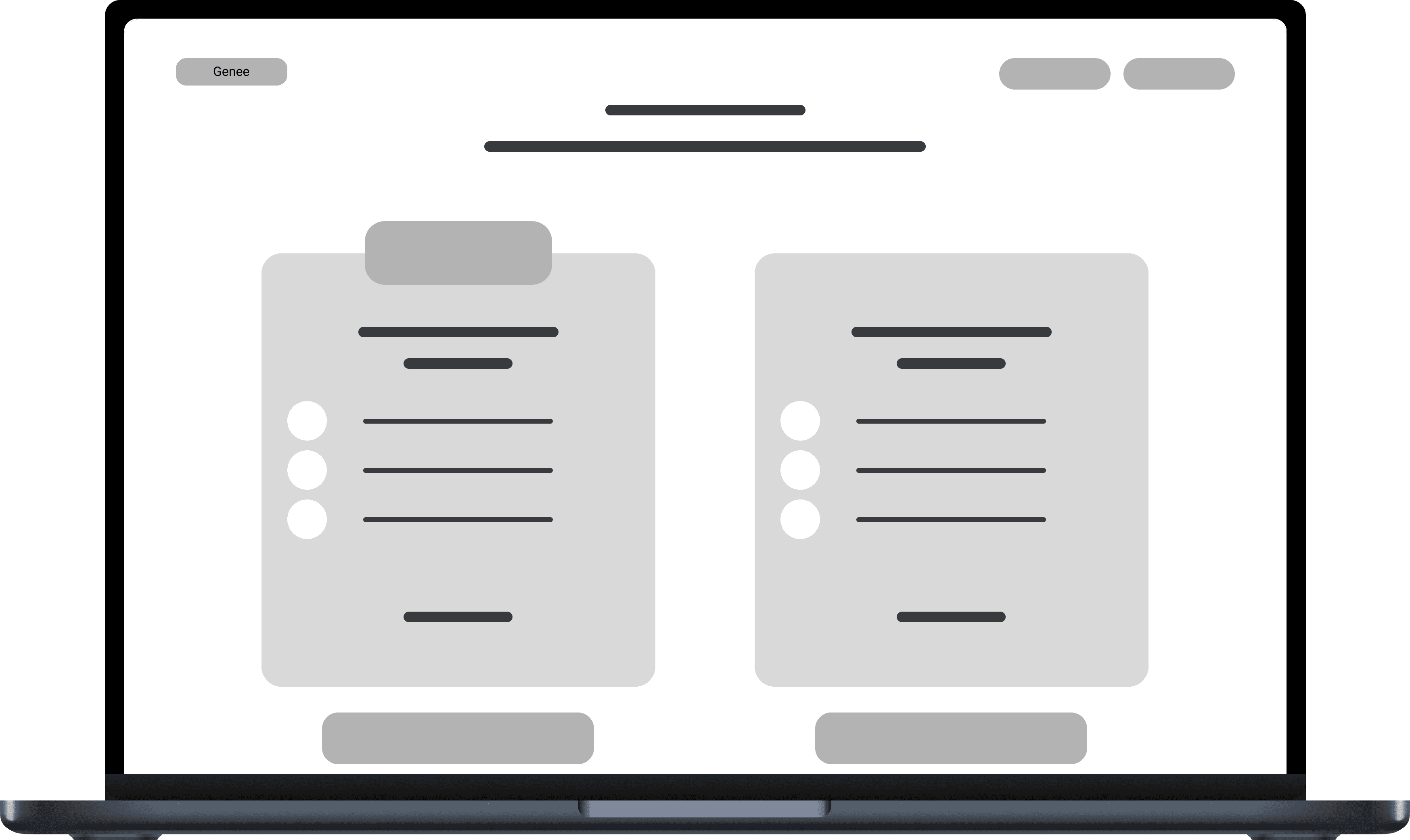
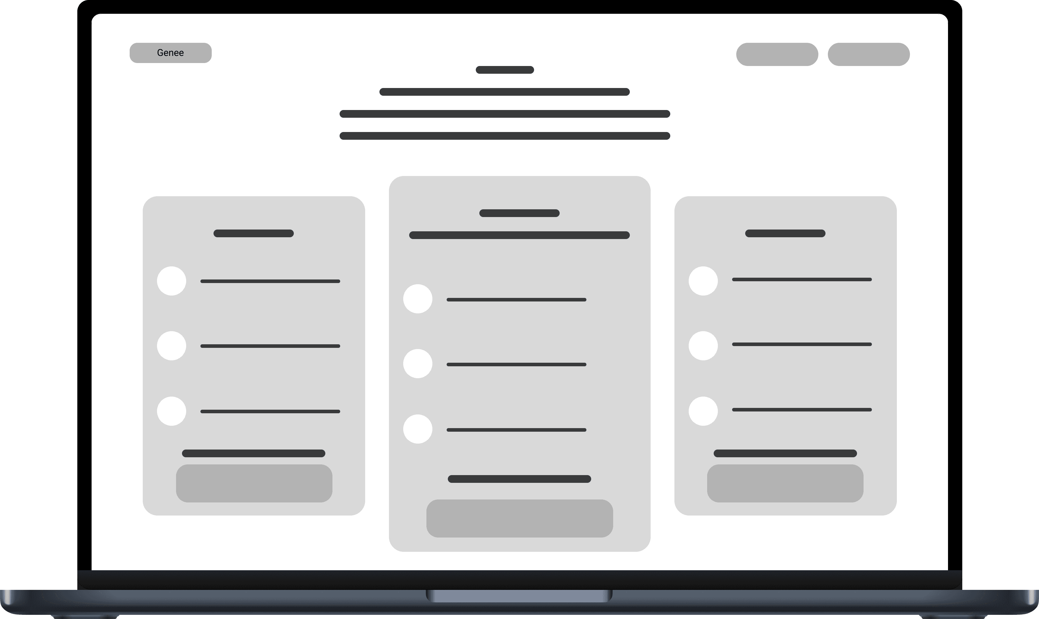
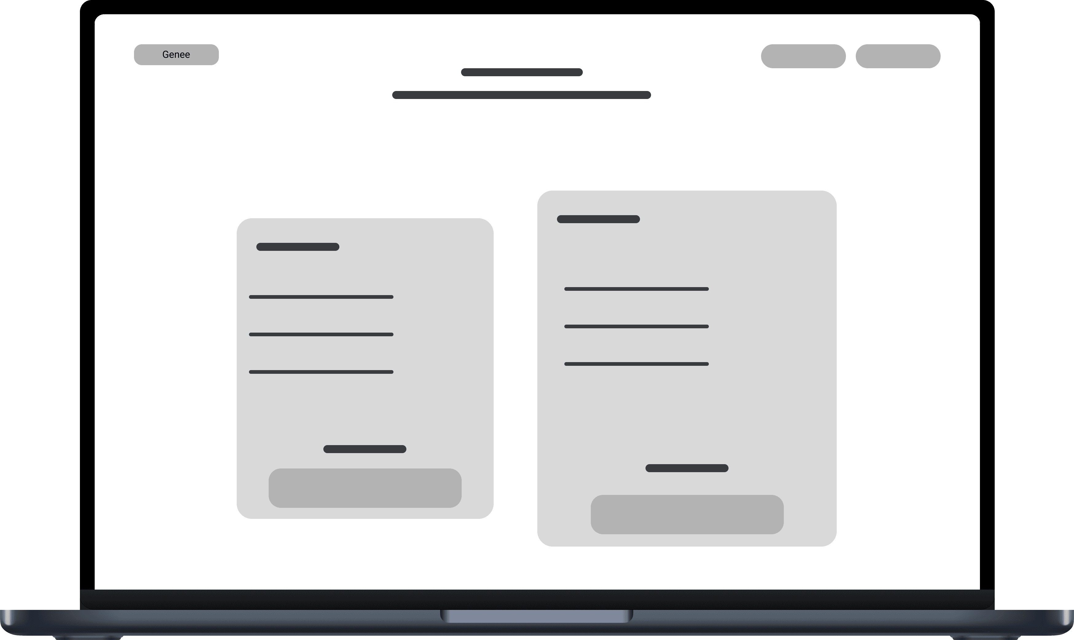
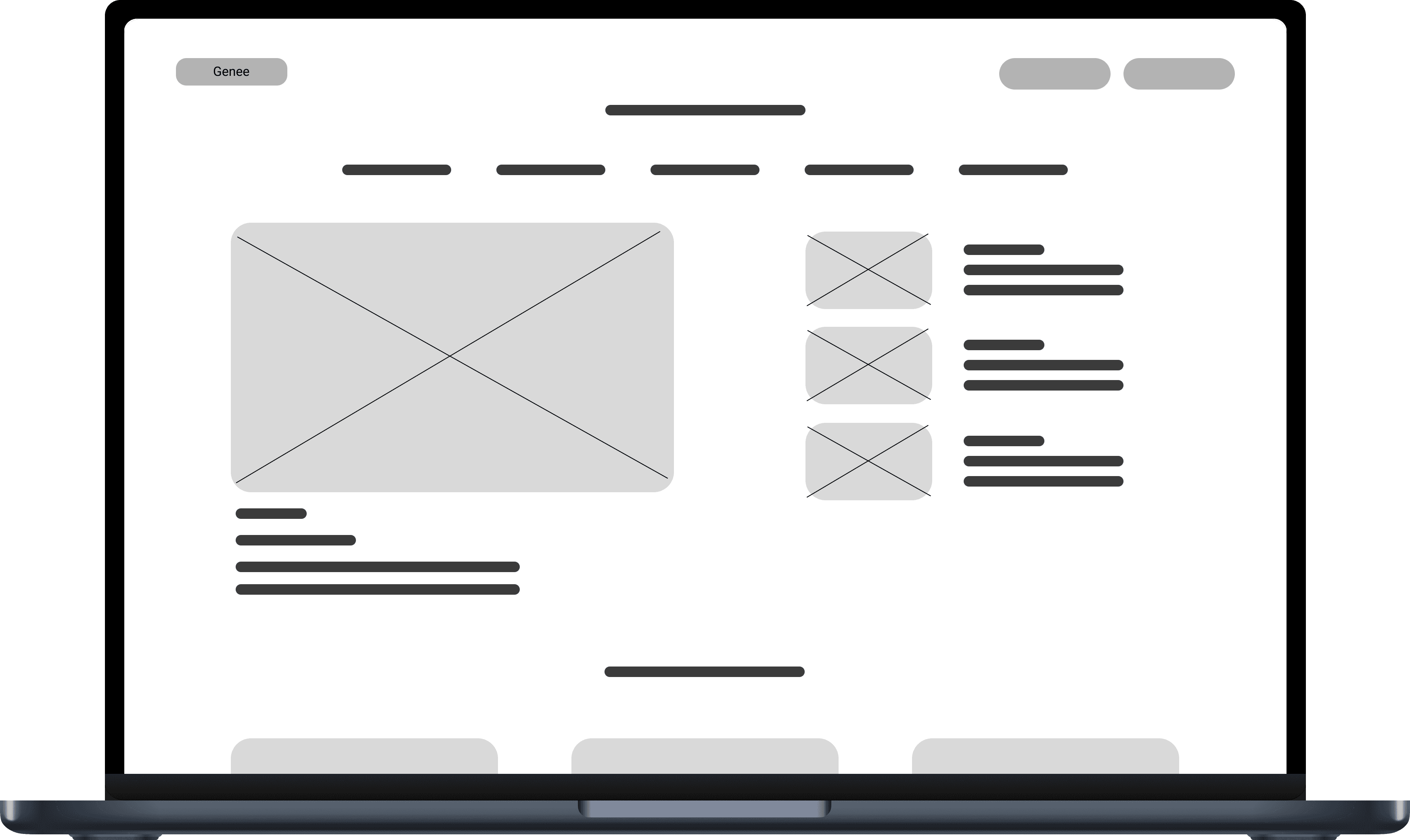
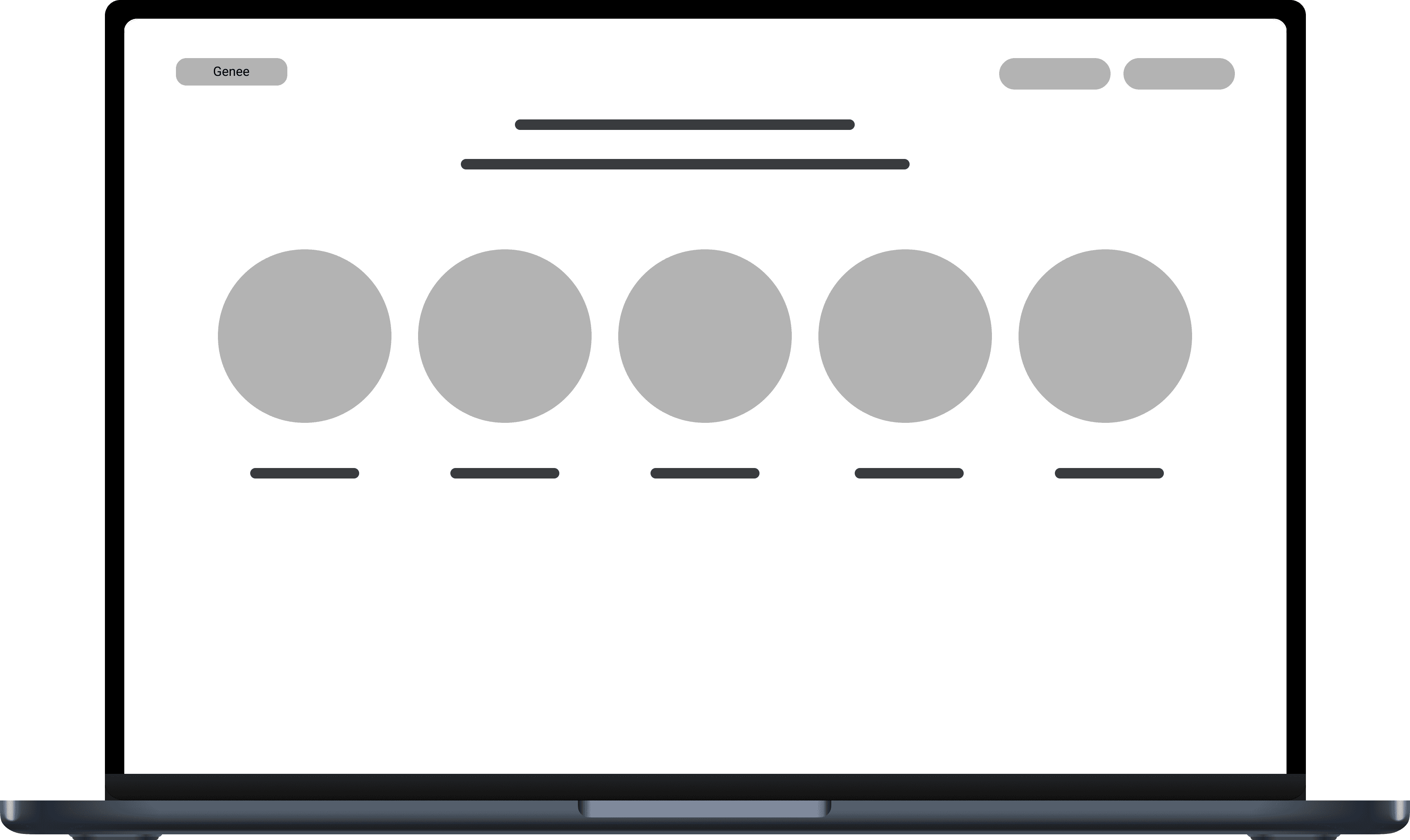
This sprint focused on fostering creativity and setting the tone for Genee's design. Given the research insights about users feeling stuck and unsure, I prioritized creating a homepage that made users feel seen and understood. To bring this vision to life, I developed sketches, low fidelity wireframes, and high fidelity screens that showcased Genee's new brand identity in an engaging and user-friendly way. Collaborating closely with our senior design lead and the client, I designed key sections of the homepage, including the hero section, the Genee process, membership benefits, meet the coaches, and membership plans.

Design Sprint B

In this sprint, I concentrated on organizing and refining Genee's design system to enhance efficiency and consistency. While working on Sprint A, I maintained a typography and color system in Figma to simplify collaboration and ensure cohesive designs across the project. Using Figma's typography and color variables, I developed a responsive homepage that seamlessly adapts to tablet and mobile screens. I paid close attention to how elements would adjust for smaller screen sizes and accounted for the absence of mouse hover interactions, ensuring an optimal user experience on all devices.

03

Design Sprint A

Genee's New Homepage Design

Sketches

The Genee team wanted to retain much of their existing content from Elevate for the new website, so the client already had a clear vision of the sections they wanted to include. I was tasked with creating design iterations for the hero section, the process or "how it works" section, the membership pricing plans, and the free resources section. I started my design process with some rough sketches, keeping in mind the following:


Hero Section:

  • The client emphasized incorporating movement and micro-interactions, so I focused on how users might experience the hero section as they scrolled through the homepage.

Process Section:

  • Many websites show process information in a "path" or "journey," so I explored visual representations for how users might engage with Genee's three-step coach matching process.

  • I considered using Genee's logo—a lowercase "g"— to visually depict the steps, with its tail as a journey-like design element.

Pricing Plans:

  • With Genee's two-tier pricing structure, I sketched layouts to prominently feature the "preferred" or "most popular" plan, ensuring it stood out to users.

  • I also explored designs with a third plan for future flexibility.

Free Resources Section:

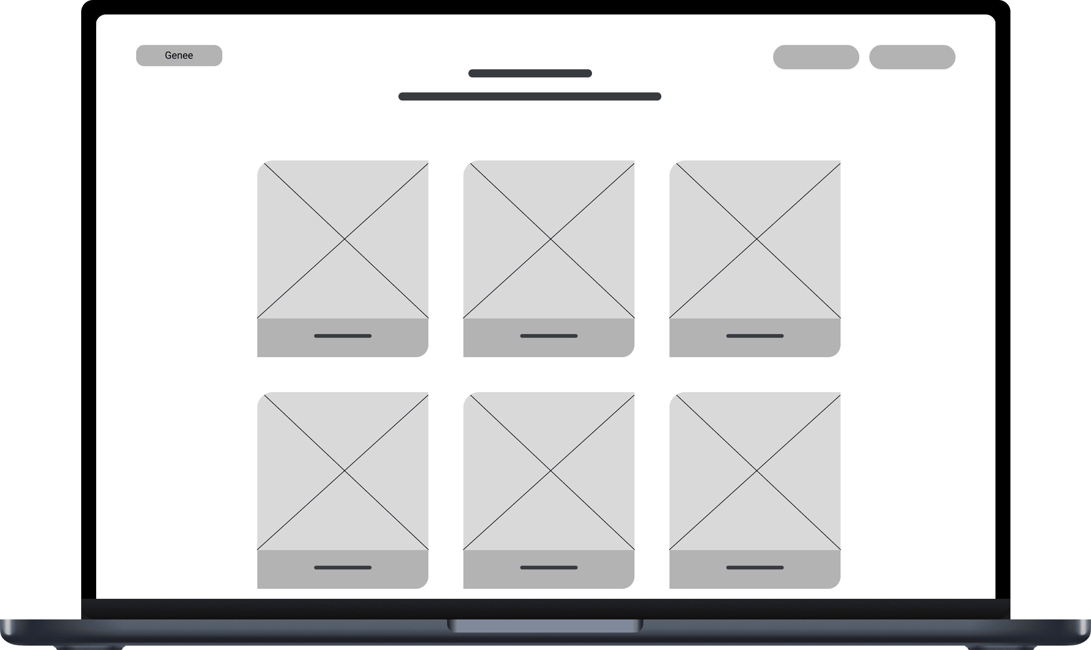
  • I considered showcasing the resources section in a blog or news-style format, so users could access videos and articles effectively.

  • I drafted layouts featuring thumbnails and captions to capture users' attention and facilitate easy navigation to desired content.

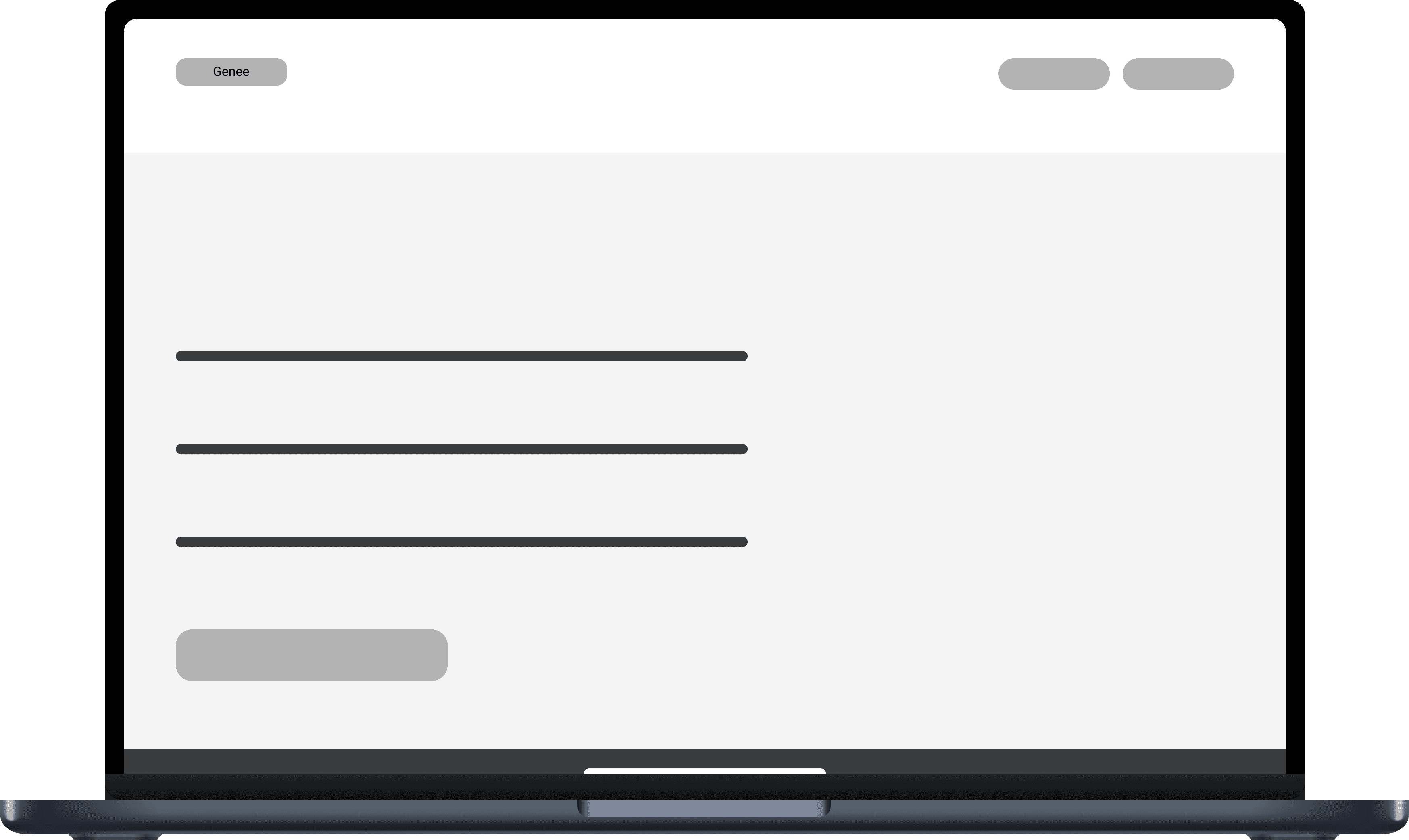
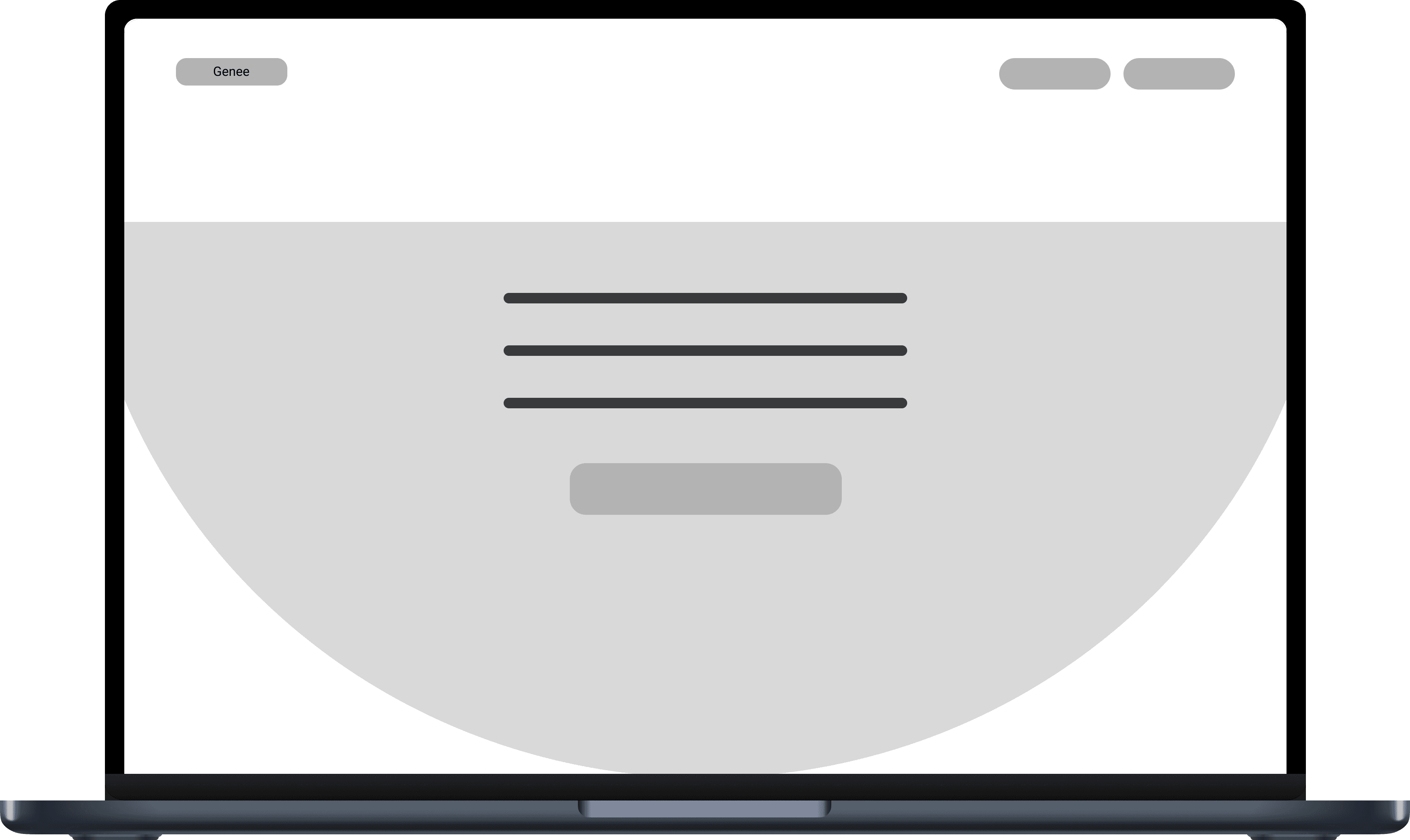
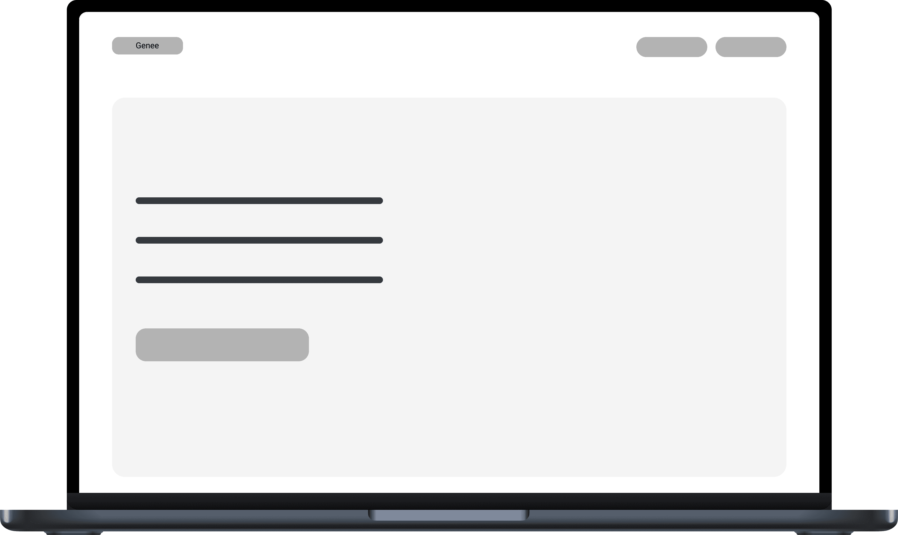
Low Fidelity Wireframes

Building on my sketches, I created low fidelity wireframes to present to the client, focusing on establishing the website's layout and structure. These wireframes were intentionally minimal, with no text, copy, or images, allowing me flexibility to explore multiple iterations for each section and refine the design direction.

Scroll high fidelity screen to view full image.

This case study is under construction. Please check back shortly for more updates!

Last updated Dec. 9, 2024 7:38PM EST

Last updated Dec. 9, 2024 7:38PM EST

Last updated Dec. 9, 2024 7:38PM EST

Thanks for reading! Check out my other projects—

Thanks for reading! Check out my other projects—

Thanks for reading! Check out my other projects—

Home

Home

Home

Back to Top

Back to Top

Back to Top